THE TRINITY PROJECT: A POLYGLOT ANALYSIS
Artometrics relies on a modern data stack. While the primary
visualizations in this report are built using R and ggplot2, the
underlying data manipulation flows across three languages. Below is a
live demonstration of our "Trinity" workflow: using R to establish the
environment, SQL to query the catalog, and Python to run rapid
statistical diagnostics — all within a single rendered document.
#| echo: false
#| warning: false
#| message: false
library(DBI)
library(RSQLite)
library(reticulate)
con <- dbConnect(RSQLite::SQLite(), ":memory:")
dbWriteTable(con, "anime_sql", anime)
dbWriteTable(con, "genre_sql", anime_genres)
if (!py_module_available("pandas") || !py_module_available("numpy")) {
py_install(c("pandas", "numpy"))
}
anime_python_safe <- anime %>%
mutate(across(where(lubridate::is.Date), as.character),
across(where(is.POSIXt), as.character))
<style>
.trinity-fold {
background: #F2F0EB;
border-left: 4px solid #C0392B;
padding: 16px 20px;
margin: 16px auto;
border-radius: 2px;
max-width: 850px;
text-align: left;
}
.trinity-fold summary {
font-family: Helvetica, sans-serif;
font-size: 1rem;
font-weight: bold;
color: #1C1C1E;
cursor: pointer;
outline: none;
list-style-position: inside;
}
.trinity-fold summary:hover { color: #C0392B; }
.trinity-fold pre { margin-top: 16px !important; }
</style>
I. The SQL Aggregations
By treating the MyAnimeList dataset as a relational database, we can
isolate format hit-rates and genre performance with precision.
Click to expand SQL Query 1: Format Hit-Rates
WITH FormatCounts AS (
SELECT type,
COUNT(*) AS total_shows,
SUM(CASE WHEN score >= 8 THEN 1 ELSE 0 END) AS elite_shows
FROM anime_sql
GROUP BY type
)
SELECT type,
total_shows,
elite_shows,
ROUND((CAST(elite_shows AS FLOAT) / total_shows) * 100, 2)
AS elite_pct
FROM FormatCounts
WHERE total_shows > 100
ORDER BY elite_pct DESC;
What it shows: TV leads at 8.12% (346 elite titles out of 4,260
total). Movie sits at 4.82% despite its prestige association — flooded
with franchise recap films. ONA is the youngest format at 1.21%,
reflecting a catalog still maturing into quality. Music's 0.20% is a
category artifact: promotional videos evaluated by a narrative scoring
system.
Click to expand SQL Query 2: Top Genres by Average Score
SELECT g.genre,
COUNT(a.animeID) AS volume,
ROUND(AVG(a.score), 2) AS avg_score
FROM genre_sql g
JOIN anime_sql a ON g.animeID = a.animeID
WHERE a.score > 0
GROUP BY g.genre
HAVING volume > 500
ORDER BY avg_score DESC
LIMIT 5;
What it shows: Mystery leads at 7.14 average across 605 titles —
the smallest qualifying genre and the highest scoring. Shounen is the
more structurally impressive result: 1,770 titles holding a 7.02
average means industrial-scale production without the quality dilution
that volume usually brings. These are not niche wins. They are
structural.
II. The Python Diagnostics
We pass the data into Python using pandas and numpy to examine the
statistical architecture of the platform before visualizing it.
Click to expand Python Script 1: Correlation Matrix
#| message: false
import pandas as pd
import numpy as np
anime_py = r.anime_python_safe
valid_scores = anime_py[anime_py['score'] > 0]
correlation_cols = ['score', 'members', 'favorites', 'episodes']
print("--- Pearson Correlation Matrix ---")
print(valid_scores[correlation_cols].corr().round(3))
What it shows: Score and membership correlate at r = 0.389 —
popular shows score higher, but the relationship is far from
deterministic. The most striking number is members↔favorites at r =
0.776: reach and obsession are tightly coupled. The shows that build
large audiences also tend to convert them into fanatics. Score↔episodes
is nearly zero at r = 0.076, which dismantles the intuition that longer
shows are better shows.
Click to expand Python Script 2: Cult Classic Filter
#| message: false
cult_classics = anime_py[
(anime_py['score'] > 8.0) &
(anime_py['popularity'] > 2000) &
(anime_py['members'] > 10000)
]
print(f"Found {len(cult_classics)} high-scoring shows buried "
f"deep in the popularity ranks.")
print(cult_classics[['title_english', 'score',
'popularity']].head())
What it shows: 90 titles score above 8.0 while sitting past
popularity rank 2,000 — well outside the range of algorithmic
recommendations. These are the archive's hidden rooms. A score above 8
represents genuine critical consensus; a rank above 2,000 means almost
no one was pushed there by the platform.
THE DATA SCIENCE OF ANIME
A CENTURY OF DATA
This MyAnimeList dataset covers 13,631 unique anime titles spanning 1917
to 2019. It is a century-scale archive tracing anime from prewar theater
shorts to the standardized streaming machine of the 2010s. The key
interpretive move here is separating catalog reality — what actually
got made — from fan-canon popularity — what people actually watched
and rated.
WHAT 6.38 ACTUALLY MEANS
The overall median MAL score is 6.38. This is our calibration point. A
6.38 isn't a failure — it's the mathematical center of a platform where
over 13,000 titles compete for attention. When comparing studios and
formats throughout this report, the question is never who broke 8.0
once. It's who consistently stayed above 6.38 across a large catalog.
That is a far harder problem.
1. ANIME RELEASES PER YEAR BY TYPE
#| echo: false
#| warning: false
#| message: false
#| fig-width: 10
#| fig-height: 6.5
type_colors <- c(
"TV" = art_secondary,
"Movie" = art_highlight,
"OVA" = "#E67E22",
"Special" = "#8E44AD",
"ONA" = "#16A085",
"Music" = art_mid
)
valid_types <- c("TV", "Movie", "OVA", "Special", "ONA", "Music")
chart1_df <- anime %>%
filter(!is.na(aired_from_year), !is.na(type),
type != "", type %in% valid_types) %>%
count(year = aired_from_year, type, name = "n")
start_year <- chart1_df %>%
group_by(year) %>%
summarise(total = sum(n)) %>%
filter(total >= 10) %>%
pull(year) %>%
min()
end_year <- max(chart1_df$year, na.rm = TRUE) - 1
chart1_df <- chart1_df %>%
filter(year >= start_year, year <= end_year)
smooth_df <- chart1_df %>%
group_by(type) %>%
filter(dplyr::n_distinct(year) >= 12) %>%
ungroup()
p1 <- ggplot(chart1_df, aes(x = year, y = n, color = type)) +
geom_line(linewidth = 0.9, alpha = 0.65) +
geom_smooth(data = smooth_df, se = FALSE, method = "loess",
span = 0.35, linewidth = 1.1) +
facet_wrap(~ type, scales = "free_y", ncol = 3) +
scale_color_manual(values = type_colors, guide = "none") +
theme_artometrics() +
labs(
title = "An industry that industrialized — then diversified",
subtitle = paste0(
"Each format tells a different story about how anime scaled. ",
"<span style='color:#C0392B'>TV</span> is the engine; ",
"ONA is the future arriving."
),
x = NULL, y = "Titles released",
caption = "Source: MyAnimeList via TidyTuesday (2019) | artometrics.com"
)
ggsave("chart1_releases_by_year.png", plot = p1, path = chart_dir,
width = 12, height = 7, dpi = 300, bg = "white")
p1
THE PATH TO INDUSTRIALIZATION
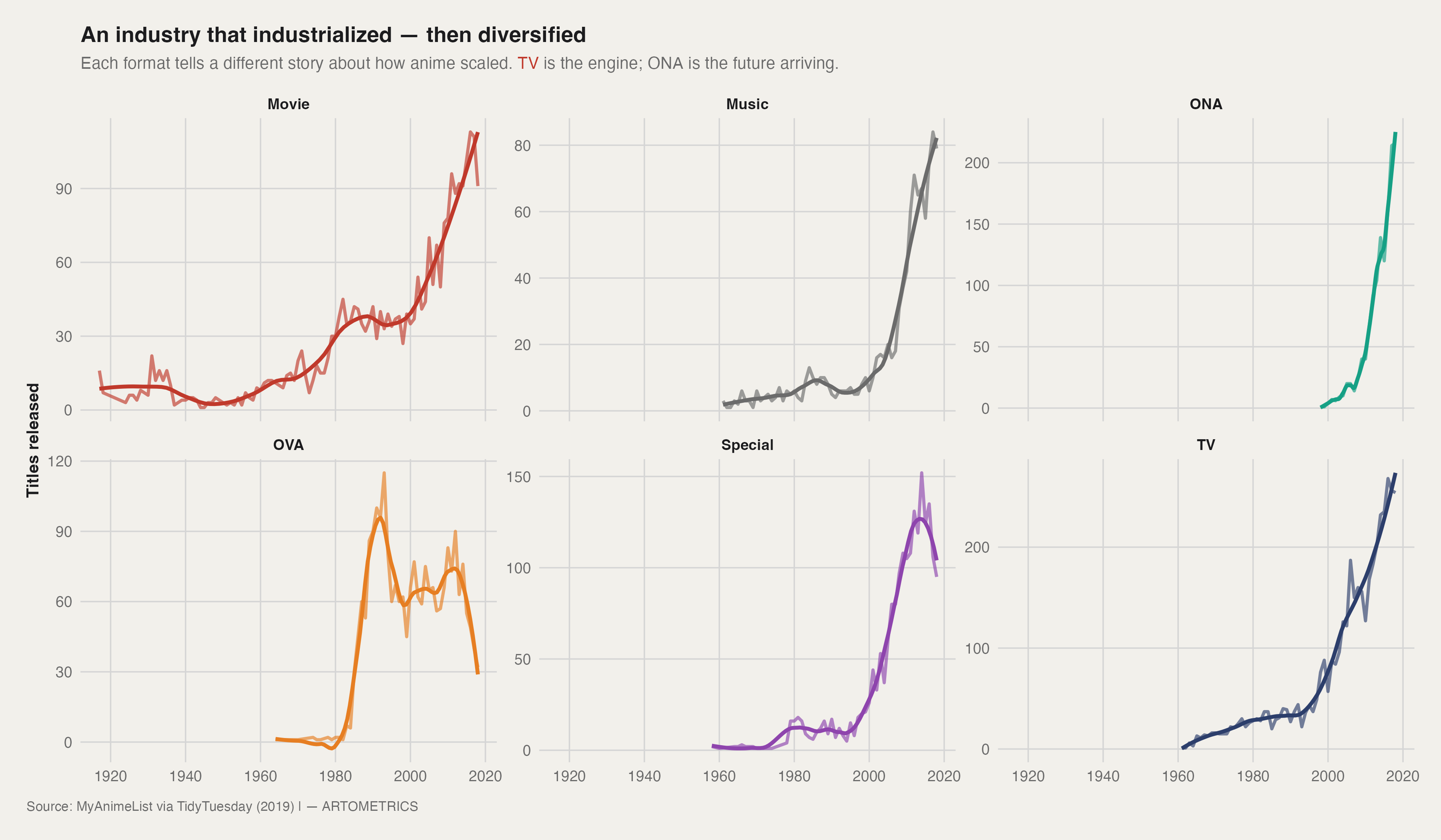
The release history of anime is not a single growth story — it is six
separate ones running in parallel. Movies were the dominant format
from the 1920s through the 1970s, a low-volume craft economy built for
theater. The first structural break arrived in the late 1980s, when the
OVA boom gave creators a direct-to-consumer channel that bypassed TV
censors entirely. OVA peaked around 1990, then collapsed as TV economics
took over.
TV is the modern engine. It industrialized in the late 1990s and has
compounded steadily since. Specials peaked in the mid-2000s as a
franchise extension format, then plateaued. Music videos spiked
dramatically in the 2010s — largely driven by short promotional content
— and then fell just as fast. The most important line on this chart is
ONA: near-zero before 2010, then a vertical ascent. That is not a
genre trend. It is a platform shift. Netflix, Crunchyroll, and YouTube
did not just distribute anime — they created a new format category.
2. HIT-RATE BY FORMAT
#| echo: false
#| warning: false
#| message: false
#| fig-width: 10
#| fig-height: 6.5
type_quality <- anime %>%
filter(!is.na(score), score > 0, !is.na(type),
type %in% c("TV","Movie","OVA","Special","ONA","Music")) %>%
distinct(animeID, .keep_all = TRUE) %>%
group_by(type) %>%
summarise(
n_titles = n(),
p_ge_8 = mean(score >= 8, na.rm = TRUE),
n_ge_8 = sum(score >= 8, na.rm = TRUE),
.groups = "drop"
) %>%
mutate(
type = forcats::fct_reorder(type, p_ge_8),
label = paste0(
scales::percent(p_ge_8, accuracy = 0.1),
" (", n_ge_8, "/", scales::comma(n_titles), ")"
),
is_tv = type == "TV"
)
p2 <- ggplot(type_quality, aes(x = p_ge_8, y = type, fill = is_tv)) +
geom_col(alpha = 0.9) +
geom_text(aes(label = label), hjust = -0.05, size = 3.4,
color = art_dark) +
scale_fill_manual(
values = c("TRUE" = art_highlight, "FALSE" = art_secondary),
guide = "none"
) +
scale_x_continuous(
labels = scales::percent_format(accuracy = 1),
limits = c(0, max(type_quality$p_ge_8) * 1.22)
) +
theme_artometrics() +
theme(panel.grid.major.y = element_blank()) +
labs(
title = paste0(
"<span style='color:#C0392B'>TV</span> is the ",
"highest-yield format — by a meaningful margin"
),
subtitle = paste0(
"Share of titles scoring 8+ by format. ",
"Labels show count of qualifying titles out of total."
),
x = "Percent of titles scoring 8+", y = NULL,
caption = "Source: MyAnimeList via TidyTuesday (2019) | artometrics.com"
)
ggsave("chart2_hitrate_by_format.png", plot = p2, path = chart_dir,
width = 10, height = 6, dpi = 300, bg = "white")
p2
YOUR ODDS OF FINDING SOMETHING GREAT
If you pick a title at random from this dataset, what are your odds it
scores 8 or above? The SQL query gives the exact answer.
TV delivers the best odds: 8.12%. For every 100 TV shows sampled,
roughly 8 will be genuinely excellent. That sounds modest until the
comparison lands. Movies — despite the prestige association with Studio
Ghibli and theatrical releases — deliver only 4.82%. The format is
flooded with franchise recap films and compilation cuts that depress the
average. OVA sits at 2.94%, Specials at 2.05%, ONA at a nascent 1.21%,
and Music at 0.20%.
TV's edge comes from structure. Weekly episode releases build communities
in real time. Long-form storytelling allows for character investment that
a 90-minute film cannot generate. The seasonal format creates competitive
pressure: a show that fails to hook audiences in its first cour rarely
gets a second. The format is ruthless, and ruthlessness filters for
quality.
THE OUTLIER: MUSIC AT 0.20%
Two out of 1,011 Music titles scored 8+. This is not just a low
hit-rate — it is a category mismatch. Music anime are short promotional
videos, not narrative works. They exist to sell singles, not to be
evaluated as stories. Their presence in a quality-scoring framework is a
dataset artifact, not a commentary on the format.
3. POPULARITY VS SCORE
#| echo: false
#| warning: false
#| message: false
#| fig-width: 10
#| fig-height: 6.5
chart3_bins <- anime %>%
filter(!is.na(score), score > 0, !is.na(popularity),
popularity > 0,
type %in% c("TV","Movie","OVA","Special","ONA","Music")) %>%
distinct(animeID, .keep_all = TRUE) %>%
filter(popularity <= 12000) %>%
mutate(
pop_decile = factor(
ntile(log10(popularity), 10),
levels = 1:10,
labels = paste0("D", 1:10)
)
) %>%
group_by(pop_decile) %>%
summarise(
score_med = median(score),
score_q25 = quantile(score, 0.25),
score_q75 = quantile(score, 0.75),
.groups = "drop"
)
p3 <- ggplot(chart3_bins,
aes(x = pop_decile, y = score_med, group = 1)) +
geom_ribbon(aes(ymin = score_q25, ymax = score_q75),
fill = art_secondary, alpha = 0.15) +
geom_line(linewidth = 1.1, color = art_secondary) +
geom_point(size = 2.5, color = art_highlight) +
theme_artometrics() +
labs(
title = "The more popular, the higher the score — but the gap is structural",
subtitle = paste0(
"Titles binned into popularity deciles (D1 = most popular). ",
"Line = median score; band = IQR."
),
x = "Popularity decile (D1 most popular -> D10 least popular)",
y = "MAL score",
caption = "Source: MyAnimeList via TidyTuesday (2019) | artometrics.com"
)
ggsave("chart3_popularity_vs_score.png", plot = p3, path = chart_dir,
width = 10, height = 6, dpi = 300, bg = "white")
p3
THE FRONT GALLERY VS THE BACK ROOMS
The decile chart tells a clean story: move from D1 (median ~7.7) to D10
(median ~5.8), and scores fall steadily. But the IQR band reveals
something more important. In D1–D3, the ribbon is narrow — millions of
ratings wash out outliers and scores converge. In D8–D10, the band
widens significantly.
This is the platform's two-tier structure. The Front Gallery is
stabilized by volume. The Back Rooms are volatile: small rating
pools mean one passionate community can inflate a score, or one wave of
disengaged viewers can tank it. The correlation matrix confirms it —
score and membership correlate at only r = 0.389. Popularity predicts
quality directionally, not precisely.
The algorithmic feedback loop runs in one direction: visibility creates
more visibility. Streaming platforms push what is already popular. The
loop is self-reinforcing but not self-correcting — it amplifies
already-known shows rather than surfacing great unknown ones. Those 90
cult classics from the Python filter exist because the algorithm left
them behind, not because they aren't good.
4. STUDIO CONSISTENCY
#| echo: false
#| warning: false
#| message: false
#| fig-width: 10
#| fig-height: 6.5
studio_summ <- anime_studios %>%
distinct(animeID, studio) %>%
inner_join(anime %>% distinct(animeID, score, type),
by = "animeID") %>%
filter(!is.na(studio), studio != "",
!is.na(score), score > 0,
!is.na(type), type != "") %>%
group_by(studio) %>%
summarise(
n_titles = n(),
median_score = median(score),
q1 = quantile(score, 0.25),
q3 = quantile(score, 0.75),
tv_share = mean(type == "TV"),
.groups = "drop"
) %>%
filter(n_titles >= 20) %>%
arrange(desc(median_score)) %>%
slice_head(n = 20) %>%
mutate(studio_label = paste0(studio, " (n=", n_titles, ")"))
p4 <- ggplot(studio_summ,
aes(y = reorder(studio_label, median_score),
x = median_score)) +
geom_errorbarh(aes(xmin = q1, xmax = q3),
height = 0, linewidth = 0.7, color = art_mid) +
geom_point(aes(size = n_titles, color = tv_share), alpha = 0.95) +
geom_vline(xintercept = 6.38, linetype = "dashed",
linewidth = 0.7, color = art_highlight, alpha = 0.7) +
scale_color_viridis_c(
option = "D",
labels = scales::percent_format(accuracy = 1),
name = "TV share"
) +
theme_artometrics() +
theme(plot.margin = margin(10, 30, 10, 10)) +
labs(
title = "Bones and KyoAni lead — consistency across volume is the real achievement",
subtitle = paste0(
"Top 20 studios by median MAL score (min 20 titles). ",
"Bars = IQR. Dot size = output."
),
x = "Median MAL score", y = NULL,
caption = "Source: MyAnimeList via TidyTuesday (2019) | artometrics.com"
)
ggsave("chart4_studio_rankings.png", plot = p4, path = chart_dir,
width = 12, height = 8, dpi = 300, bg = "white")
p4
CONSISTENCY OVER PEAKS
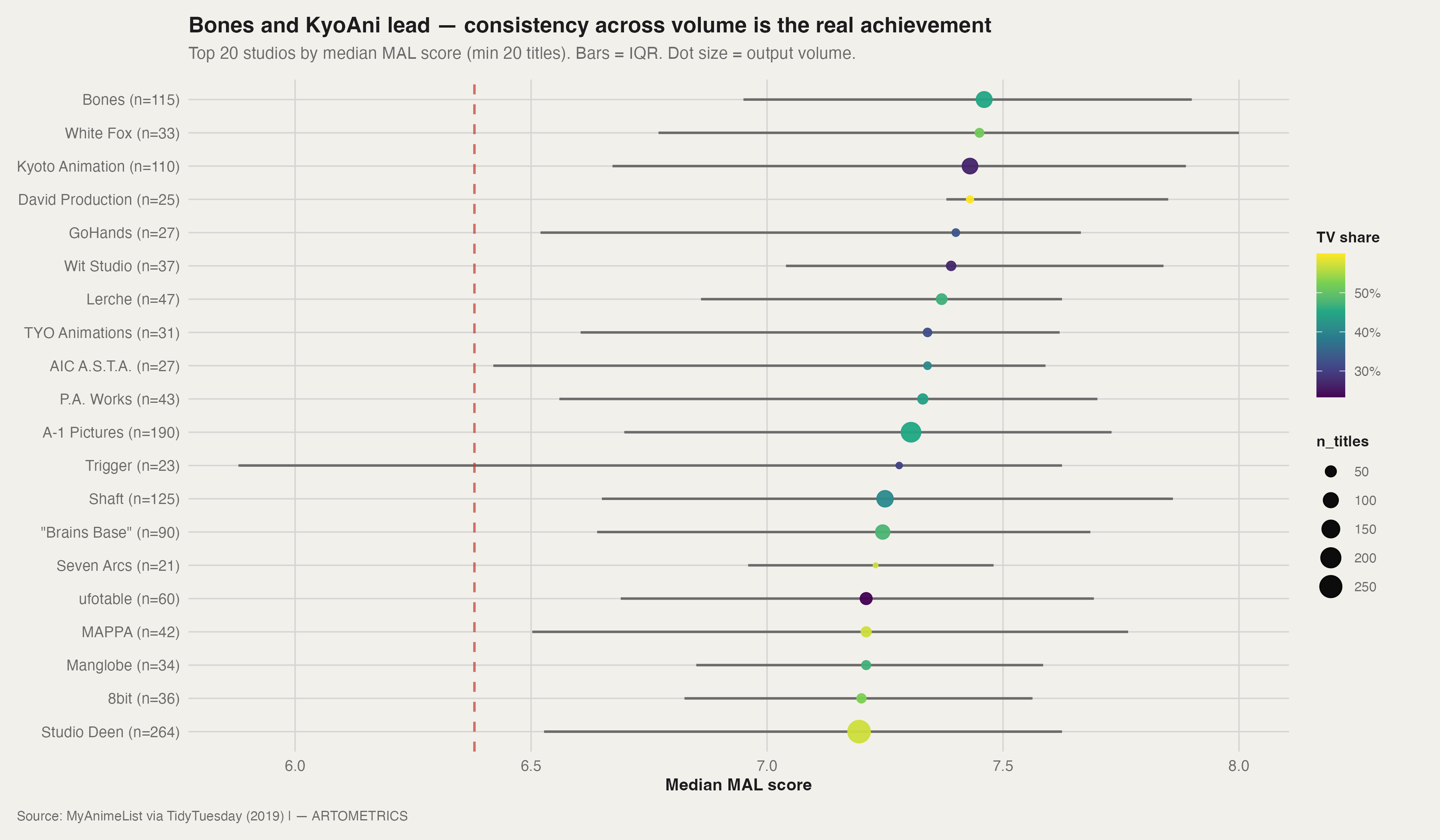
Every studio on this chart has produced at least one great show. That is
not the achievement. The achievement is the IQR bar — the horizontal
line showing the spread between the 25th and 75th percentile of a
studio's scores. A tight bar at a high median means the studio's worst
output is nearly as good as its best.
Bones (n=115) leads in median and maintains a tight IQR across a
massive catalog. White Fox (n=33) has the highest median dot but a
wide IQR — the boutique model: fewer swings, but when they miss, they
miss. Kyoto Animation (n=110) is the most consistent large studio on
the chart: 110 titles with a tight IQR anchored well above the 6.38
baseline.
Trigger (n=23) has the widest IQR — spanning from near the baseline
to above 8.0. High-risk, high-reward. Studio Deen (n=264) is the
industrial cautionary tale: the largest catalog on the chart and the
lowest median. Volume without curation dilutes quality. A-1 Pictures
(n=190) sits in the middle — a production machine that delivers
reliable output at scale, occasionally punctuated by genuine hits.
The viridis color scale maps TV share. Studios with higher TV share
cluster in the middle — TV volume is the primary dilution mechanism.
Boutique studios with low TV share show more extreme medians in both
directions.
5. THE GENRE MAP
#| echo: false
#| warning: false
#| message: false
#| fig-width: 10
#| fig-height: 6.5
genre_stats <- anime_genres %>%
distinct(animeID, genre) %>%
filter(genre != "") %>%
inner_join(
anime %>% select(animeID, score, popularity) %>%
filter(score > 0, popularity > 0),
by = "animeID"
) %>%
group_by(genre) %>%
summarise(
n_titles = n_distinct(animeID),
score_med = median(score),
pop_med = median(popularity),
.groups = "drop"
) %>%
filter(n_titles >= 80)
p5 <- ggplot(genre_stats,
aes(x = pop_med, y = score_med, size = n_titles)) +
geom_vline(xintercept = median(genre_stats$pop_med),
linetype = "dashed", color = art_mid, alpha = 0.4) +
geom_hline(yintercept = median(genre_stats$score_med),
linetype = "dashed", color = art_mid, alpha = 0.4) +
geom_point(color = art_secondary, alpha = 0.6) +
scale_x_reverse(trans = "log10", labels = comma) +
ggrepel::geom_text_repel(aes(label = genre), size = 3.2,
color = art_dark, max.overlaps = Inf,
show.legend = FALSE) +
theme_artometrics() +
labs(
title = "Genre map: what's popular vs what's well-rated?",
subtitle = paste0(
"X = median popularity rank (log, reversed). ",
"Y = median score. Size = titles tagged."
),
x = "Median popularity rank (log scale; 1 = most popular)",
y = "Median MAL score",
caption = "Source: MyAnimeList via TidyTuesday (2019) | artometrics.com"
)
ggsave("chart5_genre_map.png", plot = p5, path = chart_dir,
width = 12, height = 8, dpi = 300, bg = "white")
p5
THE CURATOR'S ROOMS
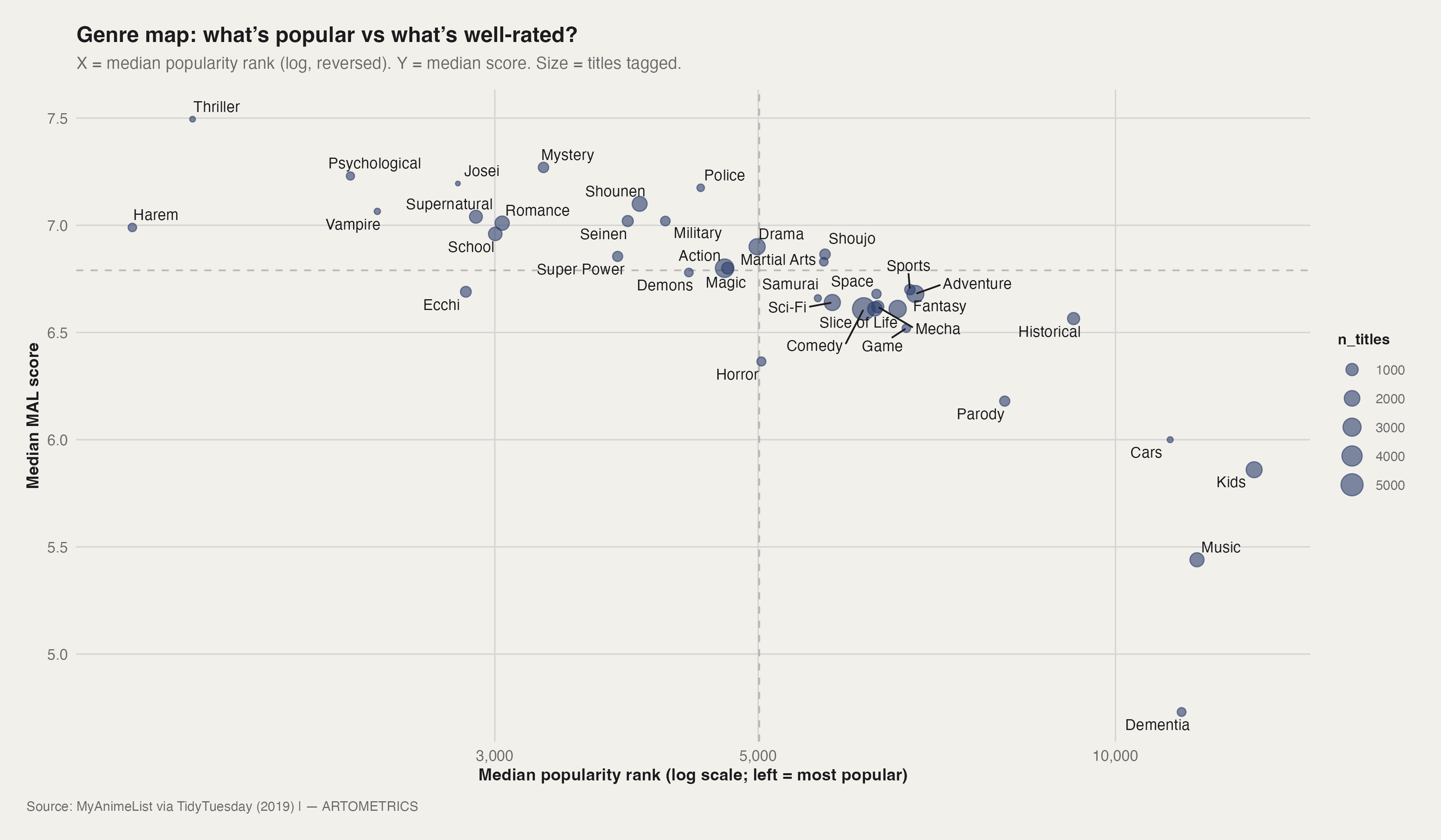
The genre map plots every major genre against two axes: how popular its
titles are (X, log-reversed so popular is right), and how well-rated
they are (Y). Size encodes volume.
The Main Hall — Action, Comedy, Fantasy, Adventure — sits in the
dense center-right cluster. Massive reach, enormous volume, medians
diluted to the mid-6s by sheer output. These are the genres that define
what most people think anime is.
The Curator's Rooms are the upper-left quadrant. Thriller sits
alone at the top: highest median on the chart (~7.5), extremely low
popularity rank. The genre barely exists by volume, but almost
everything made in it is exceptional. Mystery and Psychological
follow the same pattern — high score, mid-obscurity — which aligns with
their SQL Query 2 performance.
The starkest outlier is Historical: highly rated, sitting far to the
right — ignored algorithmically despite strong critical reception.
Dementia sits alone at the bottom (~4.8 median): low popularity, low
score, tiny volume. Kids and Music are the bottom-right anchors:
widest audiences, lowest scores. The self-selection problem in reverse —
MAL's adult userbase applying adult critical frameworks to children's
media and promotional content.
6. THE SOURCE MATERIAL SHIFT
#| echo: false
#| warning: false
#| message: false
#| fig-width: 10
#| fig-height: 6.5
source_df <- anime %>%
filter(!is.na(aired_from_year),
aired_from_year >= 1990,
aired_from_year <= 2018,
!is.na(source), source != "Unknown") %>%
mutate(source_lump = fct_lump_n(source, n = 4)) %>%
count(year = aired_from_year, source_lump) %>%
group_by(year) %>%
mutate(pct = n / sum(n)) %>%
ungroup()
p6 <- ggplot(source_df,
aes(x = year, y = pct, fill = source_lump)) +
geom_area(alpha = 0.85, color = art_cream, linewidth = 0.2) +
geom_vline(xintercept = 2006, linetype = "dashed",
color = art_dark, alpha = 0.6) +
annotate("text", x = 2006.5, y = 0.95,
label = "The 'Haruhi' Effect (2006)\nAccelerates Light Novel adaptations",
hjust = 0, size = 3.5, color = art_dark,
fontface = "italic") +
scale_fill_manual(
values = c(art_secondary, art_highlight,
"#E67E22", "#16A085", art_mid)
) +
scale_y_continuous(labels = scales::percent) +
theme_artometrics() +
labs(
title = "The Source Material Shift: The Rise of the Light Novel",
subtitle = "Share of new anime releases by source material (1990–2018)",
x = "Year", y = "Share of Titles", fill = "Source",
caption = "Source: MyAnimeList via TidyTuesday (2019) | artometrics.com"
)
ggsave("chart6_source_shift.png", plot = p6, path = chart_dir,
width = 10, height = 6, dpi = 300, bg = "white")
p6
THE NEW R&D DEPARTMENT
For most of anime's history, the pipeline was simple: a manga builds a
proven readership, a studio licenses it, TV adapts it. Manga still
anchors 40–50% of annual releases throughout the 1990–2018 window. But
the chart shows two things happening underneath.
First, the "Other" category is surprisingly large in the early
1990s, then shrinks — capturing the tail end of original studio
productions and miscellaneous licenses that couldn't be cleanly
categorized. Second, Light Novel is nearly invisible before 2006,
then begins a steady visible climb that never reverses.
The 2006 dashed line marks the Haruhi Effect. The Melancholy of
Haruhi Suzumiya demonstrated that a light novel property could generate
massive cultural impact at low production cost. Light novels are faster
to write than manga, cheaper to license, and generate rapid audience
feedback through serialized online publishing. By the 2010s, they became
the anime industry's primary outsourced R&D pipeline — and the light
novel market increasingly functions as a speculative development fund for
animation studios.
7. THE EPISODE COUNT COLLAPSE
#| echo: false
#| warning: false
#| message: false
#| fig-width: 10
#| fig-height: 6.5
ep_df <- anime %>%
filter(type == "TV", episodes > 0, episodes <= 60,
!is.na(aired_from_year)) %>%
mutate(
era = case_when(
aired_from_year < 2000 ~ "Pre-2000",
aired_from_year < 2010 ~ "2000s",
TRUE ~ "2010s"
)
)
# Annotation anchored to the 2010s facet only
chart7_annot <- data.frame(
era = "2010s",
episodes = 14,
y = 0.12,
label = "The 1-Cour Standard (12-13 eps)\nminimizes financial risk for studios"
)
p7 <- ggplot(ep_df, aes(x = episodes, fill = era)) +
geom_density(alpha = 0.7, color = NA) +
facet_wrap(~ era, ncol = 1) +
geom_vline(xintercept = 12.5, linetype = "dotted",
color = art_dark, alpha = 0.5) +
geom_text(
data = chart7_annot,
aes(x = episodes, y = y, label = label),
hjust = 0, size = 3, color = art_dark,
inherit.aes = FALSE
) +
scale_fill_manual(
values = c("Pre-2000" = art_mid,
"2000s" = art_secondary,
"2010s" = art_highlight),
guide = "none"
) +
theme_artometrics() +
labs(
title = "The 12-Episode Standardization",
subtitle = "Density of TV episode counts by era (filtered to < 60 episodes).",
x = "Total Episodes", y = "Density",
caption = "Source: MyAnimeList via TidyTuesday (2019) | artometrics.com"
)
ggsave("chart7_episode_collapse.png", plot = p7, path = chart_dir,
width = 10, height = 6, dpi = 300, bg = "white")
p7
THE 1-COUR ERA
Three eras, three completely different distributions. The Pre-2000
panel is flat and spread — episode counts range from 10 to 50+ with no
dominant peak. A successful show ran as long as it stayed profitable.
The 2000s panel shows a bimodal structure: a rising peak at 12–13
episodes and a second cluster around 24–26. Two business models
coexisting in transition. The 2010s panel is a single spike. The
1-cour standard has won.
A studio and broadcaster commit to one cour (12 episodes). If it
performs, a second cour gets greenlit. If it doesn't, the show ends.
This minimizes financial exposure for both parties. The storytelling
consequences are significant: a 12-episode arc leaves no room for
filler, and long-running character development arcs — the kind that made
1990s shonen legendary — are now economically impossible. The industry
traded narrative depth for financial safety, and audiences adapted.
8. MATURITY VS SCORE
#| echo: false
#| warning: false
#| message: false
#| fig-width: 10
#| fig-height: 6.5
rating_df <- anime %>%
filter(!is.na(rating), rating != "None",
!is.na(score), score > 0) %>%
mutate(rating = fct_reorder(rating, score, .fun = median))
n_levels <- nlevels(rating_df$rating)
p8 <- ggplot(rating_df,
aes(x = rating, y = score, fill = rating)) +
geom_boxplot(alpha = 0.7, outlier.color = art_muted,
outlier.alpha = 0.5) +
annotate(
"text",
x = n_levels, y = 8.5,
label = "Mature audiences tend to rate highly\nwhen they self-select into R-17+ content",
hjust = 1, vjust = 1,
size = 3.5, color = art_dark, fontface = "italic"
) +
scale_fill_viridis_d(option = "mako", guide = "none") +
coord_flip() +
theme_artometrics() +
labs(
title = "Who is Anime For? Score Distributions by Content Rating",
subtitle = "R-17+ holds the highest median, but PG-13 contains the highest peaks.",
x = "Content Rating", y = "MAL Score",
caption = "Source: MyAnimeList via TidyTuesday (2019) | artometrics.com"
)
ggsave("chart8_maturity_score.png", plot = p8, path = chart_dir,
width = 10, height = 6, dpi = 300, bg = "white")
p8
THE DEMOGRAPHIC CEILING
R-17+ (violence & profanity) holds the highest median score. The
explanation is self-selection: viewers who seek out R-17+ content know
what they are signing up for, rate it on its own terms, and reward the
genre when it delivers. The pool of raters is invested.
PG-13 - Teens 13 or older has the widest IQR — the broadest spread
from low to high. This is where the all-time masterpieces live.
Fullmetal Alchemist: Brotherhood, Steins;Gate, Attack on Titan,
Death Note — all PG-13. The rating allows mature themes with broader
audience access, which is the combination that generates both massive
viewership and critical consensus. R-17+ raises the floor. PG-13 is
required to break the cultural ceiling.
G - All Ages has the largest box and widest whiskers — maximum
volatility. Everything from beloved children's classics to
algorithmically-generated filler exists in this tier. The audience
mismatch problem from Chart 5 applies directly here: the platform's
adult userbase applies adult critical standards to content designed for
children.
9. THE DEVOTION INDEX
#| echo: false
#| warning: false
#| message: false
#| fig-width: 10
#| fig-height: 6.5
devotion_df <- anime %>%
filter(members > 500000) %>%
mutate(devotion_rate = favorites / members)
p9 <- ggplot(devotion_df, aes(x = members, y = favorites)) +
geom_point(color = art_secondary, alpha = 0.6, size = 3) +
geom_smooth(method = "lm", color = art_highlight,
linetype = "dashed", se = FALSE) +
ggrepel::geom_text_repel(
data = devotion_df %>% slice_max(devotion_rate, n = 10),
aes(label = title_english),
size = 3.5, color = art_dark, box.padding = 0.5
) +
annotate("text", x = 1250000, y = 30000,
label = "The Casual Viewing Zone\nHigh reach, low obsession",
color = art_mid, size = 3.5) +
scale_x_continuous(labels = scales::comma) +
scale_y_continuous(labels = scales::comma) +
theme_artometrics() +
labs(
title = "The Devotion Index: Reach vs. Obsession",
subtitle = paste0(
"Titles with >500k members. ",
"Points above the line represent cult-like dedication."
),
x = "Total Members (Reach)", y = "Total Favorites (Obsession)",
caption = "Source: MyAnimeList via TidyTuesday (2019) | artometrics.com"
)
ggsave("chart9_devotion_index.png", plot = p9, path = chart_dir,
width = 10, height = 6, dpi = 300, bg = "white")
p9
WATCHING VS WORSHIPPING
The dashed regression line is the baseline. Shows on or below it have
normal obsession-to-reach ratios — their favorites track with their
membership. Shows above the line have disproportionate devotion relative
to their audience size.
Fullmetal Alchemist: Brotherhood is in a class alone: the highest
favorites count on the chart (~120,000) despite not having the largest
audience. It does not just have viewers — it has a congregation.
Steins;Gate is the clearest example of the cult model: well above
the trendline despite mid-tier membership. Every viewer who finds it
converts. Death Note sits at massive reach but near the trendline —
a cultural phenomenon that everyone watched and many moved on from.
One Piece and Hunter x Hunter cluster above the line at
mid-reach — long-running series that generate intense dedication in
their specific fanbases. Gintama has the most extreme ratio in the
lower-left: small audience relative to the chart's scope, completely
irreplaceable to those who stayed. The members↔favorites correlation of
r = 0.776 confirms the strong link between reach and obsession — but the
deviations above the trendline identify the shows that punched above
their weight in converting viewers into true believers.
10. GENRE LIFECYCLES
#| echo: false
#| warning: false
#| message: false
#| fig-width: 10
#| fig-height: 6.5
genre_trends <- anime_genres %>%
inner_join(
anime %>% select(animeID, aired_from_year, type),
by = "animeID"
) %>%
filter(type == "TV",
aired_from_year >= 1980,
aired_from_year <= 2018,
genre %in% c("Mecha", "Slice of Life", "Sci-Fi", "Fantasy")) %>%
count(year = aired_from_year, genre) %>%
group_by(year) %>%
mutate(pct = n / sum(n))
p10 <- ggplot(genre_trends,
aes(x = year, y = pct, color = genre)) +
geom_line(linewidth = 1.2) +
geom_vline(xintercept = 1995, linetype = "dotted",
color = art_mid) +
annotate("text", x = 1993, y = 0.45,
label = "Evangelion (1995)\nLate Mecha Peak",
size = 3, color = art_dark) +
geom_vline(xintercept = 2009, linetype = "dotted",
color = art_mid) +
annotate("text", x = 2010, y = 0.45,
label = "K-On! (2009)\nSlice of Life Booms",
size = 3, color = art_dark) +
scale_color_manual(
values = c(
"Mecha" = art_secondary,
"Slice of Life" = art_highlight,
"Sci-Fi" = "#E67E22",
"Fantasy" = "#16A085"
)
) +
scale_y_continuous(labels = scales::percent) +
theme_artometrics() +
labs(
title = "Genre Lifecycles: The Fall of Mecha, the Rise of Fantasy",
subtitle = "Share of TV releases among four major genres over 40 years.",
x = "Year", y = "Relative Share", color = "Genre",
caption = "Source: MyAnimeList via TidyTuesday (2019) | artometrics.com"
)
ggsave("chart10_genre_lifecycles.png", plot = p10, path = chart_dir,
width = 10, height = 6, dpi = 300, bg = "white")
p10
MARKET SATURATION AND SUCCESSION
Four genres. 40 years. Two regime changes. The chart is best read as a
succession story.
Mecha peaks at roughly 50% of the four-genre share around 1990 —
the Evangelion era — then falls almost linearly to about 7% by 2018.
The genre didn't die from quality failure; it died from saturation. By
the mid-2000s, every Mecha concept had been subverted, deconstructed, or
parodied. Evangelion itself was the genre's apex and its eulogy
simultaneously.
Sci-Fi is volatile throughout — it spikes and collapses repeatedly,
tied to individual breakout properties rather than sustained audience
demand. Fantasy rises steadily from the mid-2000s, with the 2010s
acceleration driven almost entirely by Isekai. Isekai is Fantasy with
the friction removed: no need to explain the world's rules because the
protagonist discovers them alongside the viewer. Slice of Life is
near-zero before 2000, enabled structurally by the 1-cour format from
Chart 7 — 12 episodes of low-stakes character interaction is
commercially viable in a way that 50 episodes of it never was.
11. ERA SCORING
#| echo: false
#| warning: false
#| message: false
#| fig-width: 10
#| fig-height: 6.5
era_score_df <- anime %>%
filter(!is.na(score), score > 0, aired_from_year >= 1970) %>%
mutate(decade = paste0(floor(aired_from_year / 10) * 10, "s"))
p11 <- ggplot(era_score_df,
aes(x = score, y = decade, fill = decade)) +
ggridges::geom_density_ridges(alpha = 0.8, color = art_cream,
scale = 1.5) +
annotate(
"text",
x = 6.0, y = "2010s",
label = "Modern Rating Inflation:\nThe baseline floor shifts right in the 2010s",
hjust = 0, vjust = -0.5,
size = 3.5, color = art_dark, fontface = "italic"
) +
scale_fill_viridis_d(option = "cividis", guide = "none") +
theme_artometrics() +
labs(
title = "The Recency Bias: Are Scores Inflating?",
subtitle = "Distribution of MAL scores by decade.",
x = "MAL Score", y = "Decade",
caption = "Source: MyAnimeList via TidyTuesday (2019) | artometrics.com"
)
ggsave("chart11_era_scoring.png", plot = p11, path = chart_dir,
width = 10, height = 6, dpi = 300, bg = "white")
p11
IS ANIME GETTING BETTER — OR IS THE PLATFORM INFLATING?
The ridgeline chart shows every decade's score distribution stacked
vertically. The trend is clear: each decade's distribution shifts
rightward. The 1980s center around 6.5 with a sharp peak. The
1990s broaden slightly. The 2000s shift the center of mass
toward 7.0. The 2010s peak is the furthest right, centered near
7.0–7.5.
Two explanations compete. The optimistic reading: the industry got
better. Studios learned, production quality improved, storytelling
matured. The skeptical reading: the platform inflated. Simulcast hype
generates ratings from viewers who haven't finished shows. Recency bias
means viewers discount older titles against modern pacing standards. The
MAL system has known manipulation vulnerabilities.
The dataset cannot separate these forces — and the honest answer is
both are real. The industry improved and the platform inflated
simultaneously. The 90 cult classics from the Python filter suggest
plenty of exceptional older work sits unrated simply because it lacks
modern algorithmic visibility.
12. SURVIVOR BIAS
#| echo: false
#| warning: false
#| message: false
#| fig-width: 10
#| fig-height: 6.5
survivor_df <- anime %>%
filter(type == "TV", episodes > 0,
!is.na(score), score > 0) %>%
mutate(log_eps = log10(episodes))
p12 <- ggplot(survivor_df, aes(x = episodes, y = score)) +
geom_point(alpha = 0.4, color = art_secondary) +
scale_x_log10(
breaks = c(1, 12, 24, 50, 100, 500, 1000),
labels = scales::comma
) +
geom_smooth(method = "loess", color = art_highlight,
se = FALSE) +
geom_vline(xintercept = 50, linetype = "dashed",
color = art_dark, alpha = 0.5) +
annotate("text", x = 60, y = 4,
label = "The 50+ Episode Barrier:\nOnly proven hits survive this long,\nraising the minimum score floor.",
hjust = 0, size = 3.5, color = art_dark) +
theme_artometrics() +
labs(
title = "Survivor Bias: Bad Shows Don't Run Forever",
subtitle = "MAL Score vs TV Episode Count (Log Scale).",
x = "Total Episodes (Log Scale)", y = "MAL Score",
caption = "Source: MyAnimeList via TidyTuesday (2019) | artometrics.com"
)
ggsave("chart12_survivor_bias.png", plot = p12, path = chart_dir,
width = 10, height = 6, dpi = 300, bg = "white")
p12
THE ECONOMIC FLOOR
At 12 and 24 episodes, the scatter plot shows maximum variance.
Masterpieces and disasters coexist. The LOESS curve peaks around 24
episodes — the 2-cour sweet spot where shows that earned a second season
have already proven viability — then gently declines.
Past 50 episodes, something changes. The floor visibly rises. Shows with
50+ episodes are not a random sample of anime — they are the survivors
of an economic selection process. Animation is expensive. A studio
doesn't fund episode 51 unless episodes 1–50 generated sufficient
revenue and audience retention to justify the commitment. The score floor
isn't rising because long shows are better. It's rising because bad
shows get cancelled.
This is the most important structural insight in the dataset: the
quality gradient in anime is partly an artifact of the cancellation
mechanism. Short-form content shows the full quality distribution.
Long-form content shows only what survived.
LIMITATIONS
THE CUTOFF PROBLEM
The dataset ends in 2019. Demon Slayer, Jujutsu Kaisen, Chainsaw
Man, Spy × Family — absent. Their exclusion almost certainly
understates ONA growth, understates action/Shounen dominance, and means
any claims about "current" genre trends require updating against the
post-2019 landscape.
SELF-SELECTION BIAS
MyAnimeList is an enthusiast platform. Its userbase skews adult, male,
and Western relative to anime's actual global audience. Two direct
consequences appear in the data: Kids and Music programming are
systematically underscored, and shows with strong Western fandom overlap
(Fullmetal Alchemist: Brotherhood, Death Note) may be
overrepresented in the elite tiers.
MULTI-LABEL INFLATION
Genre tags are not mutually exclusive. A show tagged both "Military" and
"Action" contributes to both aggregations. "Military" scores well in the
genre map largely because it co-occurs with acclaimed Shounen action
properties. The genre medians should be read as blended signals, not
clean categories.
SMALL SAMPLE INSTABILITY
Boutique studios (n < 30) and niche genres (< 100 titles) have volatile
medians. White Fox's second-place studio ranking rests on 33 titles — a
single poor season could meaningfully shift it. Thriller's top-ranked
genre position rests on a small title count. Directionally interesting,
statistically fragile.
POPULARITY RANK DIRECTIONALITY
In this dataset, popularity rank 1 is the most popular. Lower numbers
mean higher popularity. The genre map reverses the X-axis to make this
intuitive visually, but it is worth flagging for readers interpreting
the SQL output directly.
CONCLUSION
THREE STRUCTURAL TRANSITIONS
Anime transformed its business model three times in a century: from a
theatrical craft economy built for prewar audiences, to a
home-video OVA market that bypassed broadcast entirely, to an
industrialized TV machine running on seasonal 12-episode contracts,
and finally into a diversified platform ecosystem where ONA and
streaming have created a fourth distribution channel that did not exist
before 2010.
THREE THINGS THAT DIDN'T CHANGE
Through all of it: TV is the primary engine for quality output
(8.12% hit-rate, the highest of any format, confirmed by both SQL and
the visual). Popularity and quality are correlated but not causal —
the feedback loop runs both directions, the algorithm amplifies existing
popularity rather than discovering hidden quality, and the score-members
correlation of r = 0.389 confirms the relationship is real but far from
deterministic. Consistency across volume is harder than a single peak
— Studio Deen has 264 titles and a lower median than Bones's 115.
THE ARCHIVE ARGUMENT
Ninety high-scoring titles sit past popularity rank 2,000 — past the
point any algorithm will surface them. The correlation between score and
episodes is r = 0.076: essentially zero. Length is not quality.
Popularity is not quality. Both are correlated directionally and
contaminated systematically by feedback loops, recency bias, and the
self-selection of who uses the platform.
The catalog is vast. The attention economy is ruthless. If you want the
best statistical odds, shop the seasonal TV hits in Mystery, Shounen, or
Romance — the three genres with the highest average scores above 500
titles. But if you are willing to walk past the algorithm's edge, there
are 90 titles waiting with scores above 8.0 and audiences small enough
that they never quite made the trending list.
—KSM
REFERENCES
MyAnimeList Dataset (2019). TidyTuesday, April 23, 2019. Retrieved from:
https://github.com/rfordatascience/tidytuesday/tree/main/data/2019/2019-04-23
MyAnimeList. (n.d.). About MyAnimeList. Retrieved from
https://myanimelist.net/about.php
Clements, J., & McCarthy, H. (2015). The Anime Encyclopedia: A Century
of Japanese Animation (3rd ed.). Stone Bridge Press.
Condry, I. (2013). The Soul of Anime: Collaborative Creativity and
Japan's Media Success Story. Duke University Press.
Denison, R. (2015). Anime: A History. BFI/Palgrave Macmillan.
Galbraith, P. W., & Karlin, J. G. (Eds.). (2012). Idols and Celebrity
in Japanese Media Culture. Palgrave Macmillan.
Ōtsuka, E., & Steinberg, M. (2010). World and Variation: The
Reproduction and Consumption of Narrative. Mechademia, 5, 99–116.
Steinberg, M. (2012). Anime's Media Mix: Franchising Toys and
Characters in Japan. University of Minnesota Press.
EDITOR'S NOTE
This report was researched, written, designed, and produced in active
collaboration with Claude AI (Anthropic). The data pipeline, statistical
analysis, chart design, written analysis, narrative structure, and visual
styling were all developed through a directed partnership between human
editorial judgment and AI execution. The research questions and brand
vision are ours. The execution is a collaboration.
— Artometrics Editorial
EDITOR'S NOTE
HOW WE MADE THE REPORT WITH CLAUDE AI
THANK YOU
PLEASE REACH OUT ANYTIME