The Hospital Readmissions Reduction Program is a Medicare penalty system that has been running since 2012. The premise is simple: if your patients come back to the hospital within 30 days of discharge at a higher rate than expected given their medical profile, CMS docks your Medicare reimbursements. The penalty caps at 3% of all Medicare payments — not just payments for the specific condition being measured. A hospital with too many heart failure readmissions doesn’t just lose heart failure revenue. It loses 3% of everything.
The core metric is the Excess Readmission Ratio, or ERR. It is a ratio of predicted readmissions to expected readmissions — where “expected” is risk-adjusted for each patient’s age, comorbidities, and discharge history. An ERR of exactly 1.0 means you readmitted exactly as many patients as a hospital of your type and patient mix should. Above 1.0 means more readmissions than expected. Below 1.0 means fewer. What this analysis found: nearly every condition’s national average ERR is above 1.0. HRRP has been running for over a decade, and the average American hospital is still readmitting more patients than CMS expects. The penalty hasn’t eliminated the problem. It has clarified it.
Research question
Where do CMS Hospital Readmissions Reduction Program penalties still concentrate — by state, clinical condition, and hospital ownership — in the FY2025 supplemental extract, and what does that geography imply for the 742 hospitals entering CMS’s Transforming Episode Accountability Model (TEAM) on January 1, 2026?
This is an observational audit of published CMS ratios, not a causal trial. We do not estimate a formal null hypothesis. We ask a sharper operational question: after more than a decade of HRRP, which named markets (New Jersey, Massachusetts, Mississippi), conditions (Hip/Knee arthroplasty), and ownership types (for-profit systems such as HCA and Tenet) still sit farthest above CMS’s expected readmission line?
Fast facts
The numbers that set the scale for this report:
Data and method
The FY2025 HRRP supplemental extract covers the measurement window used for CMS’s published excess readmission ratios. After removing suppressed rows — hospitals with fewer than 25 discharges for a given condition, which CMS redacts to protect patient privacy — the working dataset contains 11,720 hospital-condition pairs across roughly 2,700 hospitals and six conditions: Acute Myocardial Infarction (AMI), Heart Failure, Pneumonia, Chronic Obstructive Pulmonary Disease (COPD), Hip & Knee Arthroplasty, and Coronary Artery Bypass Graft (CABG). A hospital can perform well on five tracks and still take a hit on one.
The suppressed rows matter. Small rural hospitals disproportionately fall below the 25-discharge threshold and disappear from the analysis. The hospitals in this dataset skew toward larger, busier facilities. That is not a flaw in the extract — it is a feature of how CMS designed the program — but it shapes every finding below.
An ERR above 1.0 feeds a penalty calculation; the tier depends on how far above 1.0 a hospital sits relative to peers. For this piece, pairs are grouped into four tiers: No Penalty (ERR ≤ 1.0), Low, Medium, and High. Charts are rendered in R from the working CSVs in this monorepo ( articles/readmitted/data/ ), with PNG and interactive Plotly JSON exported side by side. Ownership labels for Chart 3 were joined from CMS Hospital General Information (dataset xubh-q36u ) and stored offline so the analysis does not depend on a live CMS download at render time.
The Geography of Failure
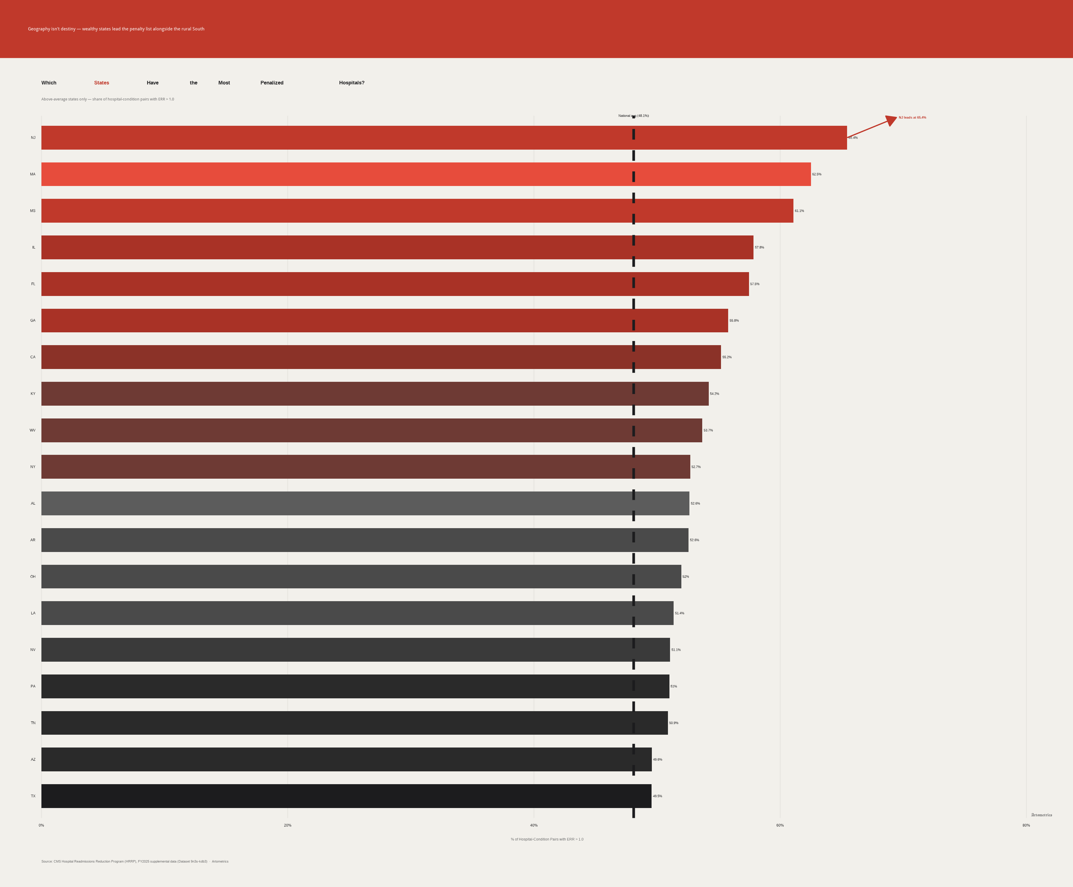
States above the national average for penalized hospital-condition pairs — New Jersey leads at 65.4%
Nearly half of all hospital-condition pairs in this dataset carry an excess readmission ratio above 1.0. That national average hides the real story: the penalties are not evenly distributed.
New Jersey leads the country at 65.4% — nearly two of every three hospital-condition pairs in the state perform worse than CMS models expect. Massachusetts ( 62.5% ) and Mississippi ( 61.1% ) follow. New Jersey hosts high-revenue systems such as Hackensack Meridian and RWJBarnabas; Massachusetts concentrates academic medical power around Mass General Brigham; Mississippi is rural, high-poverty, and chronically under-served. Different systems, different patient mixes, same penalty outcome.
Georgia, Kentucky, West Virginia, Alabama, and Louisiana cluster high — which fits the familiar population-health narrative. So do Illinois, California, New York, and Pennsylvania. This is not a rural-poverty map with a clean boundary. High-resource markets do not immunize a system.
Chart 1 shows only states above the national average — the cohort pulling the 48.1% mean up. Even below-average states are not clean. “Below average” means a smaller share of pairs exceed ERR 1.0, not zero penalties.
The Condition Nobody Is Solving
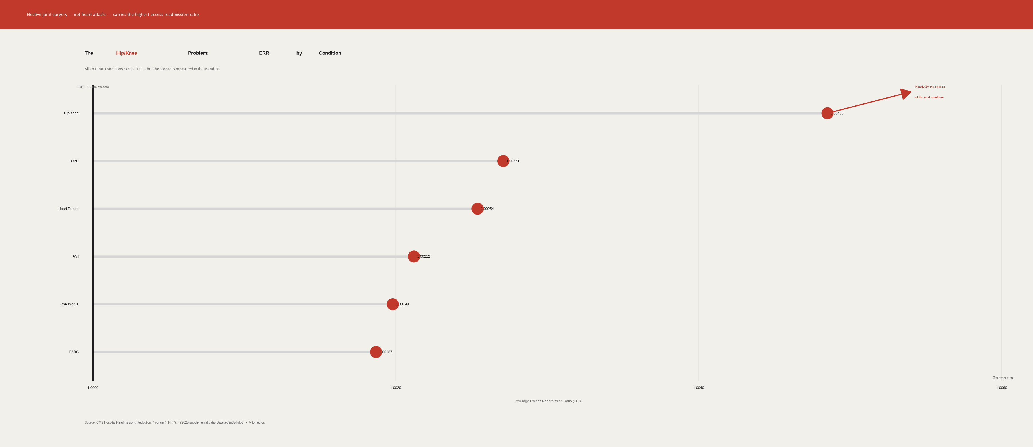
Average excess readmission ratio by HRRP condition — Hip/Knee leads at 1.00485
All six conditions tracked under HRRP carry an average excess readmission ratio above 1.0. One stands apart.
Every tracked condition still averages above 1.0. The national mean ERR is 1.0018 . Readmission rates have declined since 2012, but the program has not eliminated excess returns — it has measured them.
Hip and knee replacement patients are readmitted at nearly twice the excess rate of the next closest condition. Hip/Knee’s average ERR of 1.00485 sits above COPD ( 1.00271 ), Heart Failure ( 1.00254 ), AMI ( 1.00212 ), Pneumonia ( 1.00198 ), and CABG ( 1.00187 ). The gaps live in the fourth decimal place — and still matter when multiplied across roughly 1.3 million U.S. joint replacements a year. Elective joint surgery shifts the danger window into post-discharge days hospitals cannot monitor as stays shorten.
COPD sits near the bottom of this chart, but that is not a success story. COPD patients return at high rates in absolute terms. The lower ERR means CMS’s risk model expects a sicker baseline. The bar is lower because the patients are harder — not because outcomes are better.
Ownership, Penalty, and Who Pays
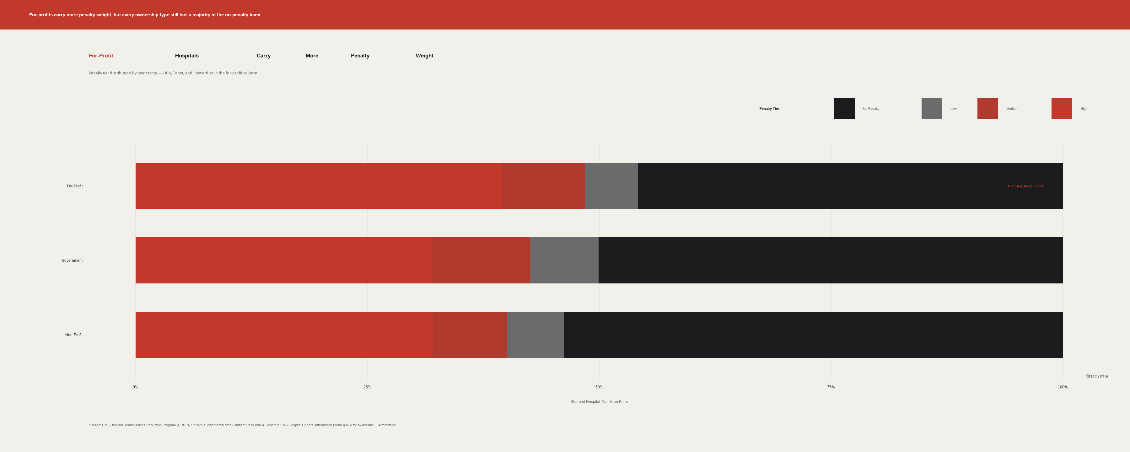
Penalty tier distribution by hospital ownership — for-profits carry more high-tier weight
For-profit hospitals carry a higher share of medium and high penalty tiers than either non-profits or government hospitals. The policy debate often oversimplifies who is actually paying.
Every ownership type has roughly half or more of its hospital-condition pairs at or below the CMS expected readmission rate. HRRP is often described as a blanket stick. The data says the stick is concentrated — closer to an audit sampling than a universal fine. Systems such as HCA, Tenet, and Steward sit in the for-profit column; that does not mean every for-profit campus is High-tier.
The gap is real — on the order of 8 to 10 percentage points more penalized pairs than non-profits — but it is a difference of degree, not kind. All three ownership types are playing the same game. For-profits lose it slightly more often.
Government-owned facilities land between non-profit and for-profit. Neither the safety-net excuse nor the public-accountability story fits cleanly. County systems operate under political oversight that can slow discharge innovation; middle-of-pack performance is its own finding.
Intensity, Not Just Share
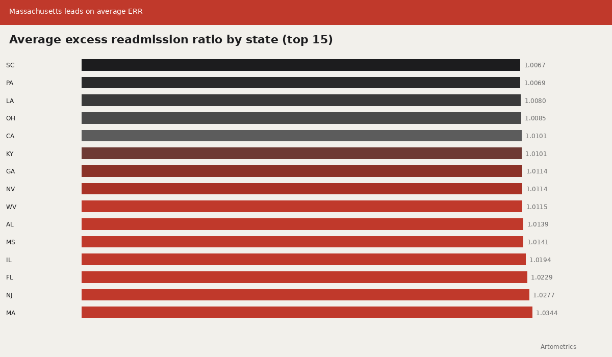
Average excess readmission ratio by state — Massachusetts leads the top 15
Chart 1 measured how widely penalties spread across hospital–condition pairs. Chart 4 measures how far above the CMS expected line those pairs sit on average. Massachusetts posts the highest average ERR in the working extract at 1.0344, ahead of New Jersey’s breadth-first pattern at 65.4% of pairs penalized.
That distinction matters for systems such as Mass General Brigham, Beth Israel Deaconess Medical Center, and the Boston academic corridor: a market can look merely “above average” on share and still run hotter on intensity. Mississippi, Illinois, and several Mid-Atlantic states also appear in the top-15 intensity list — the same mixed geography of high-resource and high-poverty markets seen in Chart 1.
The dotted reference at ERR = 1.0 is the CMS expected line. Every state in this top-15 panel sits above it. The national mean ERR of 1.0018 looks small in isolation; stacked across thousands of pairs and roughly 1.3 million U.S. joint replacements a year, fourth-decimal gaps become budget lines.
Where the High Tier Concentrates
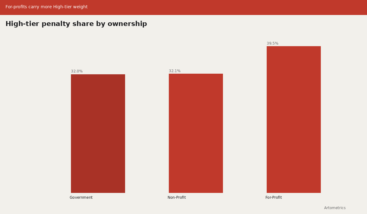
High-tier penalty share by ownership — for-profits at 39.5%
Chart 3 showed the full tier mix. Chart 5 isolates the High tier — the pairs farthest above CMS’s expected readmission rate. For-profit ownership places 39.5% of hospital–condition pairs in High, compared with roughly 32.1% for non-profits and 32.0% for government facilities.
Named for-profit operators in the CMS Hospital General Information join — including campuses associated with HCA Healthcare, Tenet Healthcare, and historically Steward Health Care — sit inside that column. The chart does not prove that for-profit status causes excess readmissions. It shows that when CMS’s published ratios are stacked by ownership, the High-tier mass sits heavier on the for-profit side.
For TEAM’s 742 mandatory hospitals in 2026, that concentration is the practical signal: episode-level accountability will land hardest where High-tier HRRP exposure already clusters, not where the “no penalty” majority still holds.
What this file cannot tell you
CMS suppresses readmission data for hospitals that fall below 25 discharges per condition per measurement period. That threshold protects statistical reliability, but the effect is systematic — small rural hospitals disappear from this analysis. The hospitals remaining skew toward larger, busier facilities.
Ownership classification for Chart 3 comes from CMS Hospital General Information, which uses inconsistent labeling across hospital types. Physician-owned facilities, tribal hospitals, and church-affiliated systems do not always map cleanly into three buckets. The Government, Non-Profit, and For-Profit groupings are reasonable approximations — not clean legal categories.
ERR compares actual readmissions to what CMS’s risk model predicts for a hospital’s patient mix. Case-mix adjustment is imperfect. Hospitals in high-poverty, high-comorbidity markets may still face structural disadvantage the model does not fully absorb. Observation-status shifts after the ACA (documented by Zuckerman et al., 2016) also mean some returns never appear as inpatient readmissions.
What to take away
Nearly half of all hospital-condition pairs still exceed CMS’s expected readmission rate — but the distribution is uneven. The highest-penalty states cut across market type and regional demographics. Hip/Knee replacement sits nearly 2× above the next closest condition on excess readmissions. For-profit hospitals carry modestly more penalty exposure than non-profits, though all three ownership types remain majority no-penalty.
HRRP has been in effect since 2012. That 48.1% of pairs still clear the 1.0 ERR threshold more than a decade later says something about the limits of financial penalties as a behavior-change mechanism. Hospitals have responded — rates have declined — but the program has defined the problem more than it has solved it.
CMS’s TEAM model, mandatory for 742 hospitals starting January 1, 2026, goes further by tying entire episodes of care to reimbursement. The hospitals that struggled under HRRP are the ones most likely to feel TEAM. This report describes the problem TEAM is designed to address. Whether bundled payments succeed where readmission penalties have not is the next question.
Sources
Joynt, K.E., & Jha, A.K. (2013). Characteristics of hospitals receiving penalties under the Hospital Readmissions Reduction Program. JAMA, 309(4), 342–343. Context on which hospitals were first exposed to HRRP penalties.
Centers for Medicare & Medicaid Services. Hospital Readmissions Reduction Program (HRRP) — FY2025 Supplemental Data. CMS Provider Data Catalog, Dataset ID: 9n3s-kdb3. https://data.cms.gov/provider-data/dataset/9n3s-kdb3
Centers for Medicare & Medicaid Services. Hospital General Information. CMS Provider Data Catalog, Dataset ID: xubh-q36u. https://data.cms.gov/provider-data/dataset/xubh-q36u — joined to HRRP data for ownership classification in Chart 3.
Centers for Medicare & Medicaid Services. (2024). Transforming Episode Accountability Model (TEAM). https://www.cms.gov/priorities/innovation/innovation-models/team — mandatory participation effective January 1, 2026 for 742 hospitals.
Medicare Payment Advisory Commission. (2024). Report to the Congress: Medicare Payment Policy, Chapter 9 (hospital inpatient and outpatient services; readmissions discussion). https://www.medpac.gov
Zuckerman, R.B., Sheingold, S.H., Orav, E.J., Ruhter, J., & Epstein, A.M. (2016). Readmissions, observation, and the Hospital Readmissions Reduction Program. New England Journal of Medicine, 374(16), 1543–1551. https://doi.org/10.1056/NEJMsa1513024
Krumholz, H.M., et al. (2017). Relationship between hospital readmission and mortality rates for patients hospitalized with acute myocardial infarction, heart failure, or pneumonia. JAMA, 318(3), 270–278. Background on readmission–mortality tradeoffs under quality measurement.
Files
Download the working datasets and chart exports used in this report. All files are hosted on this site — no external repo required.
Datasets
- hrrp_state_summary.csv — state-level penalty share and average ERR
- hrrp_condition_err.csv — average ERR by HRRP condition
- hrrp_ownership_condition.csv — ownership × condition × penalty tier counts
Charts (PNG)
- chart1_states_penalized.png
- chart2_err_by_condition.png
- chart3_penalty_by_ownership.png
- chart4_state_avg_err.png
- chart5_high_penalty_by_ownership.png
Charts (Plotly JSON)
Editor’s note
This report was researched, written, designed, and produced in active collaboration with Claude AI (Anthropic). The data pipeline, statistical analysis, chart design, written analysis, narrative structure, and visual styling were all developed through a directed partnership between human editorial judgment and AI execution. Charts are exported from R in this monorepo (articles/readmitted/). Artometrics was built on the premise that rigorous analysis and honest process are not in conflict. The research questions, editorial instincts, interpretive framing, and brand vision are ours. We document this not as a disclaimer but as a description of how we actually work.
— Artometrics Editorial