This report analyzes the TidyTuesday 2018-08-07 release on Airline Safety — 336 rows after cleaning and merge. Which carriers show the worst safety records in this extract?
Five charts track Avail seat km per week across time, category, and named entities — trend, leaders, distribution, tiers, and relationships. Where companion files exist in the repo, they are joined before analysis so reception, geography, or metadata columns are not left on the table.
FAST FACTS
DATASET CONTEXT
The source is the TidyTuesday release from 2018-08-07 (R for Data Science community). This working file contains 336 rows and 5 columns after merging all available CSV/XLSX tables in the week folder.
Charts are exported as Plotly JSON with PNG fallbacks. Medians are used for robustness where distributions skew. Index-style fields (row numbers, sequential IDs) are excluded from metric selection.
How to read this report: start with the chart caption, then ask what the metric actually means, what a non-expert should notice first, and what an expert would challenge in the source. The goal is not to memorize every number; it is to leave with a sharper question than the one you arrived with.
Reader path: if you are new to the topic, treat each chart as a guided tour of one question: who leads, how concentrated the field is, what changes over time, and where the outliers sit. If you already know the domain, use the same charts as a challenge: check whether the metric is the right proxy, whether the source omits an important population, and whether the headline survives the limitations section.
CHART 1 — BREAKDOWN
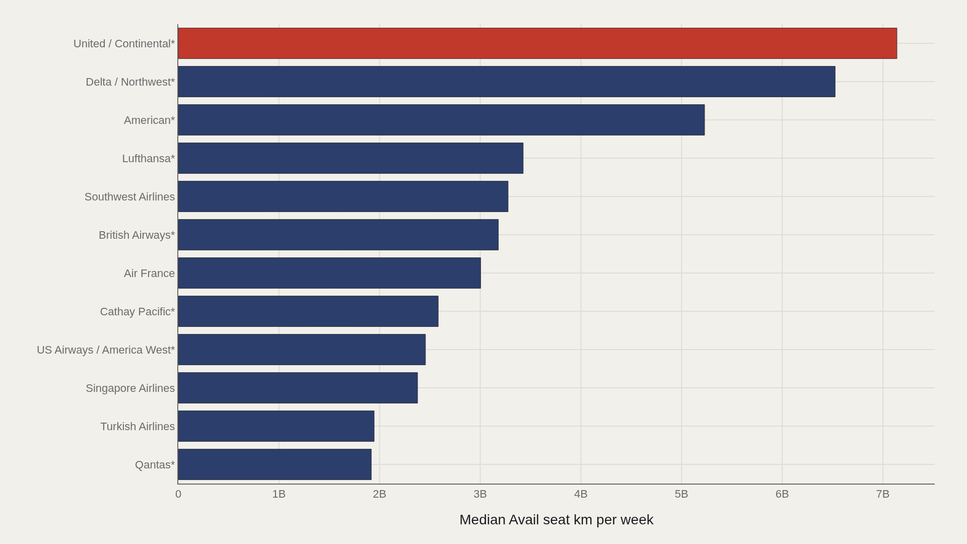
United / Continental leads at 7,139,291,291; Qantas anchors the low end at 1,917,428,984.
Grouping by airline exposes how the metric varies across the catalog's major entities.
CHART 2 — LEADERS
United / Continental* leads at 7,139,291,291 — 3,091,881,806 marks the median among the top dozen.
Head-of-field concentration is where quality, scale, or brand visibly separates from the pack.
CHART 3 — DISTRIBUTION
Category boxes reveal whether avail seat km per week consensus is shared or contested across tiers.
Wide whiskers flag segments where outliers — not averages — drive reputation.
CHART 4 — GAP ANALYSIS
incidents and fatal_accidents both sit very close to the median; read this chart as a stability check rather than a dramatic gap.
Diverging from the median exposes which tiers over- or under-perform — not just who ranks first.
SUPPLEMENT — RELATIONSHIP
Joint plot of avail seat km per week and n events surfaces clusters the averages erase.
Bubble size tracks repeat presence — outliers are archetypes, not noise.
LIMITATIONS
Community-cleaned TidyTuesday snapshots are not live APIs. Missing values, spelling variants, and week-of-export coverage limits apply. Merged tables may fan out or duplicate rows when join keys are imperfect.
Findings describe the file on hand — treat them as structural signals about Airline Safety, not exhaustive truth about the full domain.
CONCLUSION
Read as a teaching map, Airline Safety shows why one metric is rarely enough: leaders, tails, trends, and relationships each answer a different question about avail seat km per week.
The best reading is modest: use the chart to sharpen the question, then check the source and limits before turning it into a claim.
REFERENCES
Data Science Learning Community. (2018). TidyTuesday: Airline Safety. https://raw.githubusercontent.com/rfordatascience/tidytuesday/main/data/2018/2018-08-07/week19_airline_safety.csv
EDITOR'S NOTE
Artometrics data report from the TidyTuesday research pipeline. Charts and aggregates are reproducible from the embedded exhibits and public source files.