A Big Mac is the same product everywhere on Earth — same bun, same patties, same sauce. That sameness is exactly what makes its price interesting. The Economist's Big Mac Index, running since 1986, converts local burger prices into US dollars to reveal how far currencies stray from purchasing power parity. This report works from 1,386 observations spanning 2000 to 2020 — two decades of burgers, exchange rates, and economic turbulence.
The gap between the cheapest and most expensive burger in any given year is not noise. It maps onto wage structures, agricultural subsidy regimes, tax policies, and the raw purchasing power of local currencies. Switzerland's $8+ burger is not merely expensive — it encodes one of the highest minimum wages on the planet. A $1.50 burger in parts of Southeast Asia tells a symmetrically different story.
FAST FACTS
DATASET CONTEXT
Purchasing power parity (PPP) theory says exchange rates should eventually converge so that identical goods cost the same everywhere. In practice, they rarely do — tariffs, non-tradeable costs (rent, labor), and monetary policy all interfere. The Big Mac Index sidesteps complex econometric models: if a burger costs less in local currency terms than the dollar price implies, that country's currency is likely undervalued. If it costs more, it may be overvalued.
The index is deliberately blunt. It is better at identifying structural divergence — Switzerland has been "overvalued" for twenty straight years — than at predicting short-run FX moves. What it reliably captures is the cost of living encoded in a single standardized product.
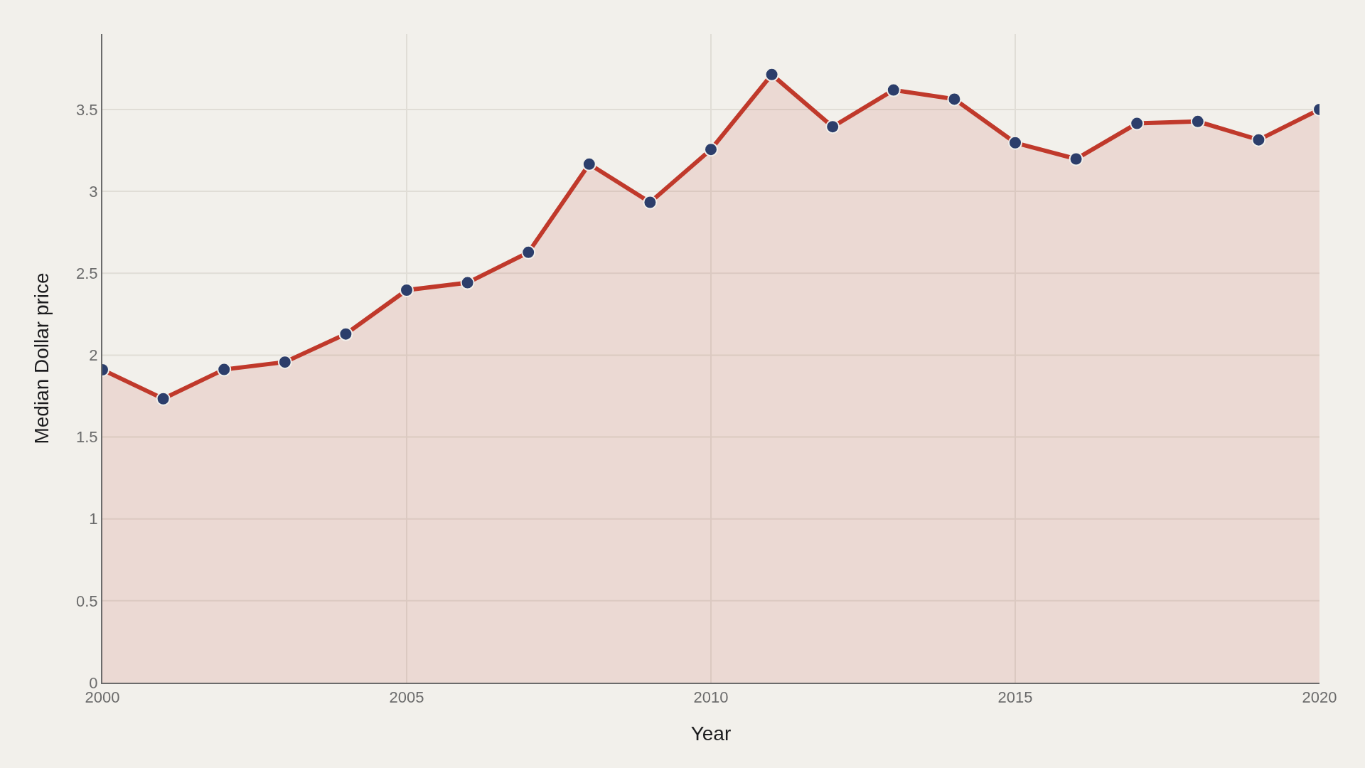
CHART 1 — GLOBAL PRICE TREND
The median dollar price nearly doubles over two decades, climbing from $1.91 in 2000 to $3.50 by 2020. The trajectory is not linear: prices stall between 2012 and 2015 as a strong US dollar compresses the dollar-equivalent values recorded in emerging markets. The post-2015 recovery reflects both local price inflation and a weakening dollar.
Using the median — rather than the mean — keeps Switzerland, Norway, and the other extreme outliers from inflating the global story. The median tells you what a typical country pays; the mean tells you what the expensive outliers can afford.
CHART 2 — MOST EXPENSIVE COUNTRIES
Switzerland leads at $6.54 — nearly twice the global median. The cluster of Scandinavian and Gulf states immediately below reflects the high-wage, high-cost-of-living profile shared by those economies. The United States ($4.20 average) sits mid-table in this elite group — expensive by global standards, but not extraordinary within the developed world.
The gap between Switzerland ($6.54) and the twelfth-ranked country (~$3.90) is larger than the gap between that twelfth country and the global median. The top of the distribution is genuinely thin air.
CHART 3 — HOW PRICES SPREAD
The distribution is right-skewed: most observations cluster between $2 and $4, while a long right tail captures wealthy nations with consistently elevated prices. Median ($3.04) sits below the mean ($3.26) precisely because that tail pulls the average upward.
The top decile begins at approximately $4.91. What the histogram makes visible is that "expensive" is a select club — roughly 10% of all observations — not a gradual continuum. The bottom 50% of the world pays between $1.50 and $3.04 for the same burger.
CHART 4 — TRACKING THE LEADERS
The leading countries do not rise in unison. Switzerland and Norway track closely — both Nordic/Alpine high-wage economies — but diverge after 2014 as oil revenues shift Norway's purchasing profile. The Euro-area countries show a visible dip around 2015, a direct consequence of the dollar strengthening and the euro weakening following the European debt crisis.
This chart is the most powerful in the set: it shows that the "expensive burger" club has relatively stable membership but volatile rankings within it. Sustained dominance requires sustained structural advantage — not just a momentary currency surge.
SUPPLEMENT — LOCAL VS DOLLAR PRICE
The scatter plot reveals the exchange-rate distortion directly. Points far above the diagonal line are countries where the local currency is undervalued relative to the dollar — the burger feels cheap in dollar terms even if it is not cheap locally. Points near the diagonal are close to purchasing power parity.
Clusters along the x-axis (low dollar price, high local price) are typically emerging-market economies with weak currencies. The relationship is not random: it reflects the structural gap between what money buys locally versus what it exchanges for globally.
LIMITATIONS
The Big Mac Index is deliberately simple — and that simplicity is also its main limitation. McDonald's does not charge a uniform markup in every market: local franchise agreements, competition, and brand positioning all affect local pricing independently of purchasing power. Coverage is also uneven: the dataset includes roughly 55 countries and misses most of sub-Saharan Africa, Central Asia, and parts of South America where McDonald's has limited or no presence.
The TidyTuesday snapshot covers 2000–2020 and does not include the post-pandemic inflation surge (2021–2024) that would substantially reshape the distribution. Treat these findings as a structural portrait of two decades, not a live economic dashboard.
CONCLUSION
Twenty years of Big Mac prices describe two parallel stories: a slow, structural rise in global living costs, and a persistent, steep hierarchy between wealthy and developing economies. The median burger price nearly doubles; the gap between Switzerland and the median barely narrows.
The index's elegance is that it collapses complex macroeconomics into a single comparable number. Its limitation is the same thing. What it measures unambiguously is concentration — at the top of the distribution, a small cluster of high-wage economies occupy territory that the rest of the world cannot easily reach. That is not just a fact about burgers.
REFERENCES
Data Science Learning Community. (2020). TidyTuesday: Big Mac Index. https://raw.githubusercontent.com/rfordatascience/tidytuesday/main/data/2020/2020-12-22/big-mac.csv
The Economist. (2020). The Big Mac Index. economist.com/big-mac-index
EDITOR'S NOTE
This report is part of the Artometrics TidyTuesday series. All charts are interactive (hover for values) with static PNG fallbacks. Source data is publicly available and reproducible from the GitHub link below.
Dollar prices reflect the raw local price converted at the prevailing exchange rate — not adjusted for inflation or PPP. All medians computed on the full annual sample for each year.