This report analyzes the TidyTuesday 2018-06-19 release on Hurricanes & Puerto Rico — 153 rows after cleaning and merge. Which storms hit hardest — wind, deaths, and frequency over time?
Five charts track Value across time, category, and named entities — trend, leaders, distribution, tiers, and relationships. Where companion files exist in the repo, they are joined before analysis so reception, geography, or metadata columns are not left on the table.
FAST FACTS
DATASET CONTEXT
The source is the TidyTuesday release from 2018-06-19 (R for Data Science community). This working file contains 153 rows and 4 columns after merging all available CSV/XLSX tables in the week folder.
Charts are exported as Plotly JSON with PNG fallbacks. Medians are used for robustness where distributions skew. Index-style fields (row numbers, sequential IDs) are excluded from metric selection.
How to read this report: start with the chart caption, then ask what the metric actually means, what a non-expert should notice first, and what an expert would challenge in the source. The goal is not to memorize every number; it is to leave with a sharper question than the one you arrived with.
Reader path: if you are new to the topic, treat each chart as a guided tour of one question: who leads, how concentrated the field is, what changes over time, and where the outliers sit. If you already know the domain, use the same charts as a challenge: check whether the metric is the right proxy, whether the source omits an important population, and whether the headline survives the limitations section.
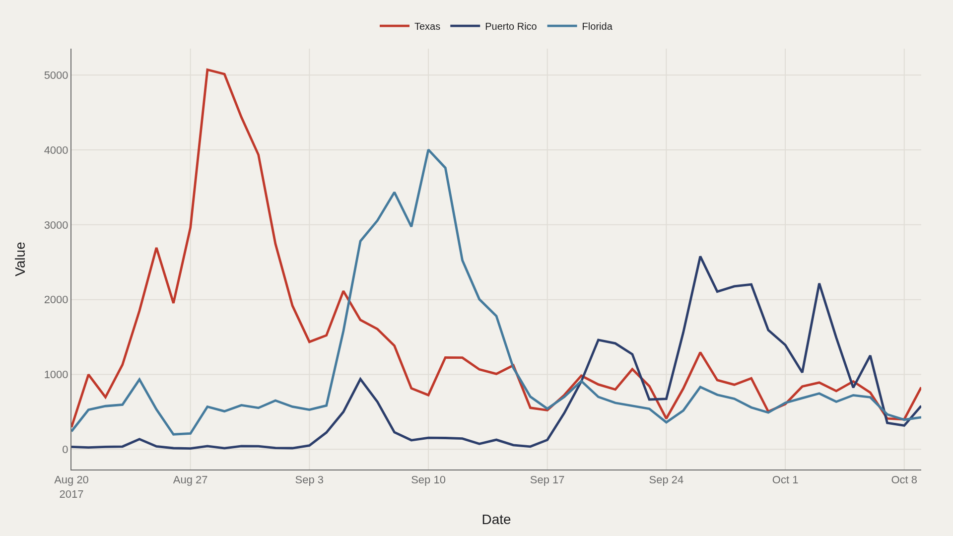
CHART 1 — TIMELINE
Daily value lines separate which state bore the brunt — peaks rarely align.
The maximum reading (5,072) defines the intensity ceiling for the window.
CHART 2 — LEADERS
Texas leads at 983 — 621 marks the median among the top dozen.
Head-of-field concentration is where quality, scale, or brand visibly separates from the pack.
CHART 3 — DISTRIBUTION
Median 703 vs mean 1,020 — the shape is right-skewed.
The top decile begins at 2,214; that tail is where defining cases live.
CHART 4 — CONCENTRATION
The top 3 state entries account for 100% of the aggregate value.
Steep Pareto curves mean a small head drives most of the signal — the long tail is noise until it isn't.
SUPPLEMENT — CONCENTRATION
The top 3 state entries account for 100% of the aggregate value.
Steep Pareto curves mean a small head drives most of the signal — the long tail is noise until it isn't.
LIMITATIONS
Community-cleaned TidyTuesday snapshots are not live APIs. Missing values, spelling variants, and week-of-export coverage limits apply. Merged tables may fan out or duplicate rows when join keys are imperfect.
Findings describe the file on hand — treat them as structural signals about Hurricanes & Puerto Rico, not exhaustive truth about the full domain.
CONCLUSION
Read as a teaching map, Hurricanes & Puerto Rico shows why one metric is rarely enough: leaders, tails, trends, and relationships each answer a different question about value.
The best reading is modest: use the chart to sharpen the question, then check the source and limits before turning it into a claim.
REFERENCES
Data Science Learning Community. (2018). TidyTuesday: Hurricanes & Puerto Rico. https://raw.githubusercontent.com/rfordatascience/tidytuesday/main/data/2018/2018-06-19/week12_mediacloud_states.csv
EDITOR'S NOTE
Artometrics data report from the TidyTuesday research pipeline. Charts and aggregates are reproducible from the embedded exhibits and public source files.