This report analyzes the TidyTuesday 2019-08-13 release on Roman Emperors — 68 rows after cleaning and merge. Who ruled longest — and did dynasty predict tenure?
Five charts track Reign years across time, category, and named entities — trend, leaders, distribution, tiers, and relationships. Where companion files exist in the repo, they are joined before analysis so reception, geography, or metadata columns are not left on the table.
FAST FACTS
DATASET CONTEXT
Reign spans are derived from start and end dates in the emperors table; negative or zero spans are excluded.
Charts are exported as Plotly JSON with PNG fallbacks. Medians are used for robustness where distributions skew. Index-style fields (row numbers, sequential IDs) are excluded from metric selection.
How to read this report: start with the chart caption, then ask what the metric actually means, what a non-expert should notice first, and what an expert would challenge in the source. The goal is not to memorize every number; it is to leave with a sharper question than the one you arrived with.
Reader path: if you are new to the topic, treat each chart as a guided tour of one question: who leads, how concentrated the field is, what changes over time, and where the outliers sit. If you already know the domain, use the same charts as a challenge: check whether the metric is the right proxy, whether the source omits an important population, and whether the headline survives the limitations section.
CHART 1 — BREAKDOWN
Constantine the Great leads at 31.0; Valentinian II anchors the low end at 17.0.
Grouping by name exposes how the metric varies across the catalog's major entities.
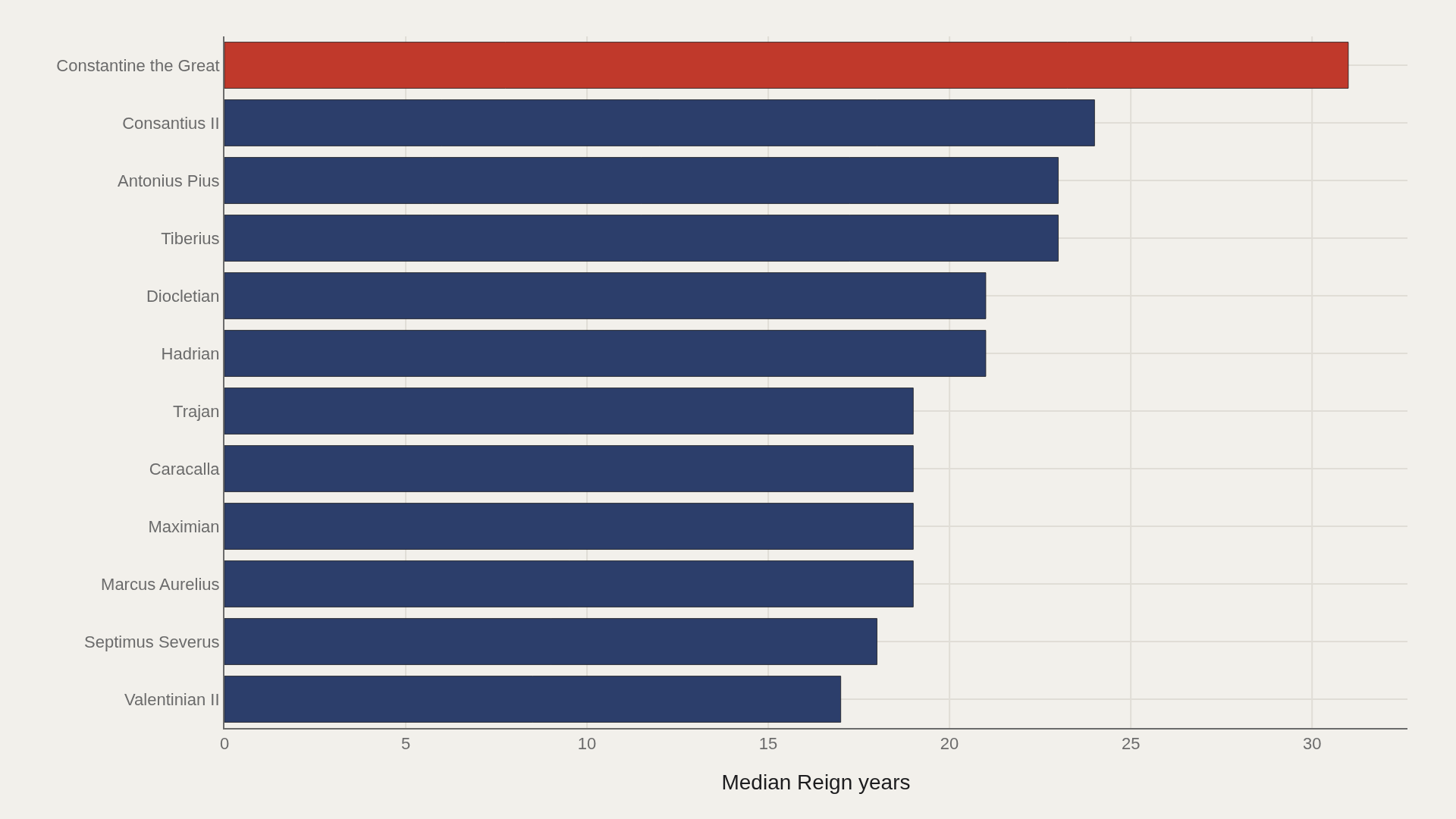
CHART 2 — LEADERS
Constantine the Great leads at 31.0 — 20.0 marks the median among the top dozen.
Head-of-field concentration is where quality, scale, or brand visibly separates from the pack.
CHART 3 — DISTRIBUTION
Category boxes reveal whether reign years consensus is shared or contested across tiers.
Wide whiskers flag segments where outliers — not averages — drive reputation.
CHART 4 — GAP ANALYSIS
Nerva-Antonine sits 12.5 above the median; Gordian trails by 4.00.
Diverging from the median exposes which tiers over- or under-perform — not just who ranks first.
SUPPLEMENT — CONCENTRATION
The top 5 name entries account for 40% of the aggregate reign years.
Steep Pareto curves mean a small head drives most of the signal — the long tail is noise until it isn't.
LIMITATIONS
Community-cleaned TidyTuesday snapshots are not live APIs. Missing values, spelling variants, and week-of-export coverage limits apply. Merged tables may fan out or duplicate rows when join keys are imperfect.
Findings describe the file on hand — treat them as structural signals about Roman Emperors, not exhaustive truth about the full domain.
CONCLUSION
Read as a teaching map, Roman Emperors shows why one metric is rarely enough: leaders, tails, trends, and relationships each answer a different question about reign years.
The best reading is modest: use the chart to sharpen the question, then check the source and limits before turning it into a claim.
REFERENCES
Data Science Learning Community. (2019). TidyTuesday: Roman Emperors. https://raw.githubusercontent.com/rfordatascience/tidytuesday/main/data/2019/2019-08-13/emperors.csv
EDITOR'S NOTE
Artometrics data report from the TidyTuesday research pipeline. Charts and aggregates are reproducible from the embedded exhibits and public source files.