Life expectancy is the most consequential number in public health. It encodes everything: nutrition, sanitation, medical access, war, famine, and the basic will of a society to keep its people alive. The dataset in this report stretches from 1543 to 2015 — 17,894 country-year observations drawn from the Our World in Data archive via TidyTuesday. No other single metric captures this much human history in this few columns.
The headline number is staggering: the global median life expectancy nearly triples over five centuries, rising from around 30 to above 73. But the aggregate trend conceals the most important story — the persistent, structural gap between the long-lived and the short-lived. The countries leading this dataset in 2015 live more than twice as long, on average, as the laggards in the same file. That gap is closing, but not fast enough to erase within any single generation.
FAST FACTS
DATASET CONTEXT
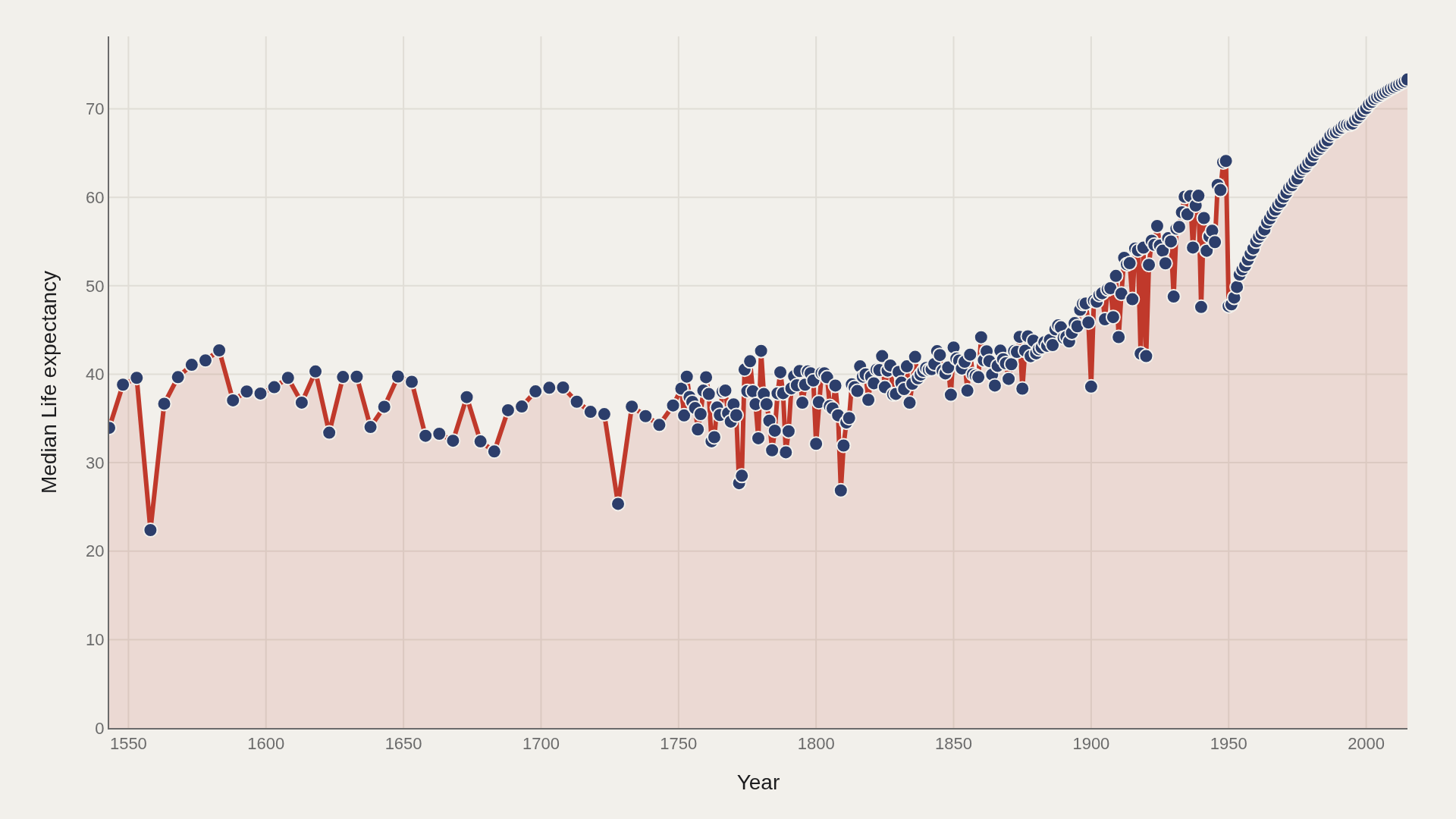
For most of recorded history, life expectancy at birth hovered between 25 and 40 years — not because people aged quickly, but because childhood mortality was catastrophic. A child born in 17th-century England had roughly a one-in-three chance of dying before age five. The adults who survived to 40 could often expect another 20–25 years, but so few survived childhood that the average plummeted.
The modern transformation begins in earnest around 1850 with clean water infrastructure, followed by the germ theory of disease, vaccines, and antibiotics in the 20th century. Each advance lifts the floor — fewer children die — which mechanically raises the average. The post-1950 acceleration in developing countries reflects this compressed version of a process that took wealthy countries a century to complete.
CHART 1 — 500 YEARS OF SURVIVAL
The long-run trend has three distinct phases. A slow, stalling climb from 1543 to roughly 1850 — progress exists but is fragile and frequently reversed by plague and famine. A sharper acceleration from 1850 to 1950, driven by sanitation and early public health. Then a steep post-1950 surge that reflects both medical breakthroughs and their diffusion into the developing world.
Notice what does not happen: the curve does not plateau after 2000. Life expectancy continues rising even in the final years of the dataset. The question is not whether this will continue, but at what rate and for whom.
CHART 2 — WHO LIVES LONGEST
Hong Kong leads at a 75.6 year average across the full dataset. The top dozen countries form a recognizable cluster: East Asian economies (Hong Kong, Japan, Singapore), Scandinavian welfare states (Iceland, Sweden, Norway), and a handful of other high-income, low-violence nations. What they share is not wealth alone — Iceland has never been rich by GDP standards — but strong public health infrastructure and social cohesion.
The gap between first (75.6) and twelfth (~73.5) is narrow. The gap between twelfth and the global median (62.4) is enormous. This is a leaders chart that reveals how thin the frontier really is — and how far back the midfield sits.
CHART 3 — THE SPLIT WORLD
The distribution tells the most uncomfortable story in this dataset. It is bimodal — two peaks, not one. One cluster sits around 35–45 years (historical pre-modern observations); another sits around 65–75 years (contemporary high-income nations). The dataset spans centuries, so these two worlds coexist in the same histogram.
The median (62.4) and mean (60.0) converge near the valley between the two peaks — which means the "average" life expectancy lands precisely where few actual observations cluster. Summary statistics here actively mislead. The story is the bimodality: two eras of human survival living in the same file.
CHART 4 — THE FRONTRUNNERS
The frontrunner countries do not rise together at the same rate. Japan's trajectory is one of the most striking: relatively ordinary through the 1950s, then an explosive acceleration from the 1960s onward driven by universal healthcare, dietary changes, and low rates of smoking. Hong Kong mirrors this but enters the top tier even earlier through its role as a trade hub with relatively strong urban public health.
Iceland and Sweden present a different profile — high from the earliest modern data, climbing steadily rather than surging. Their longevity is structural, rooted in centuries of low-density population, clean water, and eventually one of the world's earliest welfare systems.
SUPPLEMENT — WHERE LONGEVITY CONCENTRATES
The Pareto curve for life expectancy is shallower than you might expect from a deeply unequal dataset. The top 5 countries account for roughly 34% of aggregate life-years — significant concentration, but not the extreme 80/20 rule you see in wealth distributions.
What the curve reveals is that longevity, unlike wealth, has a hard ceiling. You cannot live 500 years regardless of how rich or healthy you are. This structural cap means the distribution cannot compress into a few extreme outliers the way financial distributions can. Progress in the long-lived countries has slowing returns; the biggest gains remaining are at the bottom of the distribution, not the top.
LIMITATIONS
Historical life expectancy estimates — particularly before 1800 — carry substantial uncertainty. They are reconstructed from fragmentary parish records, census data, and skeletal analysis, not modern vital statistics. Country boundaries also change: "England" in 1600 is not the same geographic or political entity as "United Kingdom" in 2015.
The dataset covers countries selectively: some regions (especially sub-Saharan Africa and Central Asia) have sparse pre-20th-century coverage, which means the global median in early centuries may overstate life expectancy in poorly-documented regions. The 2015 endpoint predates the COVID-19 pandemic, which temporarily reversed life expectancy gains in many countries — a stark reminder that the trend line is not guaranteed.
CONCLUSION
The most important fact in 472 years of life expectancy data is this: the trend is real. Humans have reliably extended their average lifespan by roughly one year per decade across the modern era. No other improvement in human welfare is this consistent or this universal.
The second most important fact is the gap. The countries at the top of this distribution live more than twice as long as the countries at the bottom. That gap is narrowing — but slowly, unevenly, and with frequent reversals. Global health progress is not a smooth ramp; it is a series of hard-won increments, each one dependent on political will, infrastructure investment, and the absence of war and famine. The data shows where we have been. What happens next is a choice.
REFERENCES
Data Science Learning Community. (2018). TidyTuesday: Global Life Expectancy. https://raw.githubusercontent.com/rfordatascience/tidytuesday/main/data/2018/2018-07-03/week14_global_life_expectancy.csv
Roser, M., Ortiz-Ospina, E., & Ritchie, H. (2019). Life Expectancy. Our World in Data. ourworldindata.org/life-expectancy
EDITOR'S NOTE
This report covers the full historical arc of the dataset, from 1543 to 2015. The bimodal distribution (Chart 3) is an artifact of combining pre-modern and modern observations in a single histogram — not a data error. Each observation represents one country in one year.
All median calculations exclude missing values. Pre-1850 data is treated as available but interpreted cautiously given reconstruction uncertainty in historical vital statistics.