This report analyzes the TidyTuesday 2019-05-21 release on Global Plastic Waste — 22,204 rows after cleaning and merge. Who generates the most plastic waste — and how much goes mismanaged?
Five charts track GDP per capita, PPP (constant 2011 international $) (Rate) across time, category, and named entities — trend, leaders, distribution, tiers, and relationships. Where companion files exist in the repo, they are joined before analysis so reception, geography, or metadata columns are not left on the table.
FAST FACTS
DATASET CONTEXT
The source is the TidyTuesday release from 2019-05-21 (R for Data Science community). This working file contains 22,204 rows and 7 columns after merging all available CSV/XLSX tables in the week folder.
Charts are exported as Plotly JSON with PNG fallbacks. Medians are used for robustness where distributions skew. Index-style fields (row numbers, sequential IDs) are excluded from metric selection.
How to read this report: start with the chart caption, then ask what the metric actually means, what a non-expert should notice first, and what an expert would challenge in the source. The goal is not to memorize every number; it is to leave with a sharper question than the one you arrived with.
Reader path: if you are new to the topic, treat each chart as a guided tour of one question: who leads, how concentrated the field is, what changes over time, and where the outliers sit. If you already know the domain, use the same charts as a challenge: check whether the metric is the right proxy, whether the source omits an important population, and whether the headline survives the limitations section.
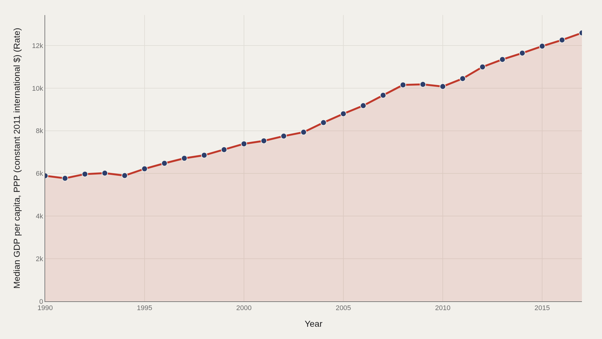
CHART 1 — TREND
Median gdp per capita, ppp (constant 2011 international $) (rate) is rising from 5,891 in the opening period to 12,592 at the close.
Annual medians filter one-off spikes so the structural slope — not viral outliers — drives the story.
CHART 2 — LEADERS
Qatar leads at 118,396 — 67,799 marks the median among the top dozen.
Head-of-field concentration is where quality, scale, or brand visibly separates from the pack.
CHART 3 — DISTRIBUTION
Median 8,447 vs mean 14,926 — the shape is right-skewed.
The top decile begins at 37,969; that tail is where defining cases live.
CHART 4 — LEADER TRENDS
The leading names do not move in lockstep — some fade as others surge.
Tracking medians over time separates sustained dominance from one-off spikes.
SUPPLEMENT — RELATIONSHIP
Joint plot of gdp per capita, ppp (constant 2011 international $) (rate) and per capita mismanaged plastic waste (kilograms per person per day) surfaces clusters the averages erase.
Bubble size tracks repeat presence — outliers are archetypes, not noise.
LIMITATIONS
Community-cleaned TidyTuesday snapshots are not live APIs. Missing values, spelling variants, and week-of-export coverage limits apply. Merged tables may fan out or duplicate rows when join keys are imperfect.
Findings describe the file on hand — treat them as structural signals about Global Plastic Waste, not exhaustive truth about the full domain.
CONCLUSION
Read as a teaching map, Global Plastic Waste shows why one metric is rarely enough: leaders, tails, trends, and relationships each answer a different question about gdp per capita, ppp (constant 2011 international $) (rate).
The best reading is modest: use the chart to sharpen the question, then check the source and limits before turning it into a claim.
REFERENCES
Data Science Learning Community. (2019). TidyTuesday: Global Plastic Waste. https://raw.githubusercontent.com/rfordatascience/tidytuesday/main/data/2019/2019-05-21/per-capita-mismanaged-plastic-waste-vs-gdp-per-capita.csv
EDITOR'S NOTE
Artometrics data report from the TidyTuesday research pipeline. Charts and aggregates are reproducible from the embedded exhibits and public source files.