This report analyzes the TidyTuesday 2021-03-23 release on UN Votes — 100,000 rows after cleaning and merge. Which UN votes split the chamber — and who dissented most?
Five charts track record counts across time, category, and named entities — trend, leaders, distribution, tiers, and relationships. Where companion files exist in the repo, they are joined before analysis so reception, geography, or metadata columns are not left on the table.
FAST FACTS
DATASET CONTEXT
The source is the TidyTuesday release from 2021-03-23 (R for Data Science community). This working file contains 100,000 rows and 4 columns after merging all available CSV/XLSX tables in the week folder.
Charts are exported as Plotly JSON with PNG fallbacks. Medians are used for robustness where distributions skew. Index-style fields (row numbers, sequential IDs) are excluded from metric selection.
How to read this report: start with the chart caption, then ask what the metric actually means, what a non-expert should notice first, and what an expert would challenge in the source. The goal is not to memorize every number; it is to leave with a sharper question than the one you arrived with.
Reader path: if you are new to the topic, treat each chart as a guided tour of one question: who leads, how concentrated the field is, what changes over time, and where the outliers sit. If you already know the domain, use the same charts as a challenge: check whether the metric is the right proxy, whether the source omits an important population, and whether the headline survives the limitations section.
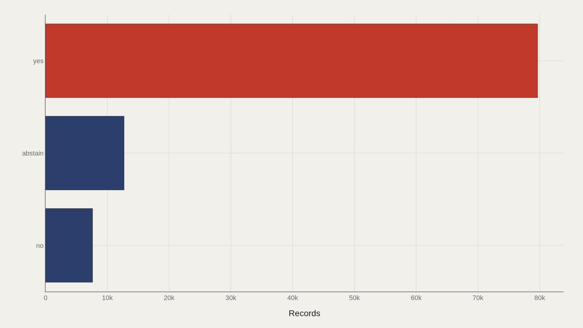
CHART 1 — LANDSCAPE
yes dominates with 79,663 records.
The main bucket carries the story; this field does not have a meaningful long-tail split.
CHART 2 — LEADERS
Brazil appears 747 times — the most recurring name in the file.
The top dozen account for a visible share of all 100,000 rows.
CHART 3 — CATEGORY
yes is the largest bucket with 79,663 records.
Category concentration shows where editorial attention should focus first.
SUPPLEMENT — FREQUENCY
Most country entities appear only once; a small head revisits repeatedly.
This power-law shape is typical of guest lists, credits, and catalog-style tables.
SUPPLEMENT — MIX
BR is the most repeated country code in the extract.
Secondary dimensions add context when the primary table has no numeric score column.
LIMITATIONS
Community-cleaned TidyTuesday snapshots are not live APIs. Missing values, spelling variants, and week-of-export coverage limits apply. Merged tables may fan out or duplicate rows when join keys are imperfect.
Findings describe the file on hand — treat them as structural signals about UN Votes, not exhaustive truth about the full domain.
CONCLUSION
Read as a teaching map, UN Votes shows why one metric is rarely enough: leaders, tails, trends, and relationships each answer a different question about the field.
The best reading is modest: use the chart to sharpen the question, then check the source and limits before turning it into a claim.
REFERENCES
Data Science Learning Community. (2021). TidyTuesday: UN Votes. https://raw.githubusercontent.com/rfordatascience/tidytuesday/main/data/2021/2021-03-23/unvotes.csv
EDITOR'S NOTE
Artometrics data report from the TidyTuesday research pipeline. Charts and aggregates are reproducible from the embedded exhibits and public source files.